{{text}}
Share
Are you looking for a clear guide to identify a Best internet site In 2026, understand what distinguishes the most successful achievements, and apply these standards to your own project. This guide presents a demanding selection, but above all an operational framework: quality criteria, web design trends, strengths and limitations, then concrete recommendations.
Synqro is a Webflow agency based in Paris, specialized in the creation of performance-oriented sites. Our positioning is simple: design a website that converts, that loads quickly, and that delivers an experience consistent with your brand. In this article, you'll identify the things that make a difference and understand how to apply these best practices to a modern website.
Website 2026: How to define a better site
A website does not become “the best” because it is spectacular. A better site is a coherent system: message, structure, and value delivered quickly. In 2026, the most beautiful websites are those that rethink navigation around a goal, based on a fair design and an experience designed for the user. In other words, beautiful design is only useful if it promotes understanding, trust, and action.
To establish a ranking of the best websites, we observe constant criteria: clarity, hierarchy, visual consistency, loading speed and mobile adaptation. The most successful websites align aesthetics and efficiency. They identify real behaviors, then optimize the paths: what we see, what we read, and what we do.
Design and user experience: what criteria make the difference
Great design starts with a legitimate identity: colors, typography, rhythm, components. The coherence of a visual system allows a website to be understood immediately, without over-explanation. Graphic choices serve hierarchy, meaning, and navigation. This is where the user experience becomes a concrete lever: a visitor understands the offer, finds the information, and takes action.
Technical performance completes the equation. A modern website should be fast and accessible. On mobile, the slight slowdown results in a loss of attention. The best websites therefore arbitrate rigorously: controlled animations, media weight, and content prioritization. When interactions are well designed, they increase engagement; when they are free, they degrade effectiveness.
Finally, the strategic dimension is essential. When creating a site, the path must be designed around the objectives: contact, discovery of the offer, reservation, purchase. The calls to action structures this path. A good site doesn't just “show”; it guides.
Top 10: best websites and the most beautiful site to study
This selection highlights references with very different mechanisms: events, e-commerce, experimental typography, humanitarian cause, brand design. The objective is to offer a list of the best that is usable: you must be able to analyze each site, understand what it does well, and then transpose.
In this top 10, each site demonstrates a specific principle: readability, narration, identity, performance or innovation. Some push the boundaries of aesthetics; others build remarkable efficiency with clean design. Together, they provide a solid foundation for “doing better,” not just “looking pretty.”
1. The Trabendo
Trabendo is a beautiful website that works by simplicity. The structure is clear, the information is accessible, and the hierarchy makes navigation immediate. The site offers a logical organization: programming, ticketing, practical information. This framework reassures and reduces friction, especially on mobile.

Its interests lie in balance: a present artistic direction, but a career without overload. The result is immersive, but clarity dominates. This is a good example of optimization: content remains a priority.
The Trabendo: https://www.letrabendo.net/
2. Repeat
Repeat is an e-commerce site built around the product, with a minimalist interface and a precise journey. The pages are interactive and focused on products: information appears at the right time, with smooth transitions. The animations are at the service of understanding.

This site shows that e-commerce can be elegant without becoming slow. Seamless browsing supports the purchase. The experience is immersive but controlled, which prevents cognitive fatigue.
- Repeat: https://getrepeat.io/
3. Crusta v.
Crusta c adopts a clean design, focused on the brand and its products. The composition highlights the visuals and lets the sections breathe. The site shows the universe without multiplying the tricks, with a clear direction.

Its strong point is consistency: the messages are aligned, the graphic elements are mastered, and the journey remains simple. It is a useful model for creating a brand site where trust is a factor for purchase.
Crusta C: https://www.crustac.fr/
4. Pp fragment
PP fragment is a demonstration of typography and bias. The design shows an experimental approach, sometimes confusing, but very consistent in its intent. Here, typography becomes an interface language.
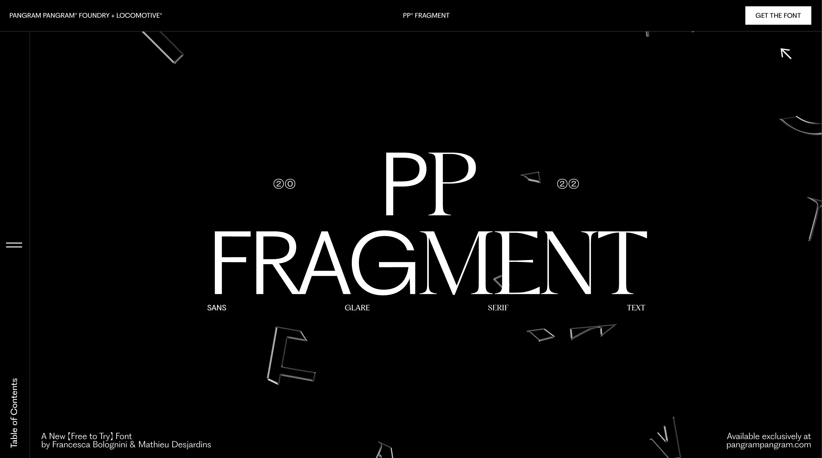
This site offers an exploration, almost an experience. We are in a more artistic digital world, where the form fully participates in the message. It's a great case for designers who want to understand how to structure an expressive system without losing track.
PP Fragment: https://pp-fragment.com/
5. Swab the World
Swab the world is a site of an organization oriented to raise awareness. It uses visual storytelling to encourage action. The cause agency or organization site must convince quickly, and here the messages are prioritized, the evidence is visible, and the calls to action are clear.

The site shows that storytelling is not a luxury: it is a conversion driver. Visitors can quickly understand the topic and take the next step. It is an example of a useful and committed journey.
Swab the World: https://swabtheworld.com/en/
6. Chiara luzzana
Chiara Luzzana's site is designed as a sound and visual immersion. It illustrates a more “artistic” use of the web, where a sensation is built. The project highlights an experience based on audio and rhythm.

This type of site must be extremely well calibrated to remain accessible. Here, overall consistency is key: the artistic direction serves a clear intention and makes the visit memorable.
Chiara Luzzana: https://www.chiaraluzzana.com/
7. Spotify design
Spotify design is an editorial showcase. The site is rich, but legitimate, because the architecture is structured. It contains resources, cases, and publications that are most relevant to design teams. The platform organizes information with a clear interface.

Its interest is educational: it highlights methods and reflections. For a web project with a content vocation, it is a reference: structure, indexing, and comfortable reading.
Spotify Design: https://www.spotify.design/
8. New Story
New Story succeeds in reconciling aesthetics, clarity and impact. The visual organization is careful, the images support understanding, and the information remains accessible. The site offers an experience that makes the cause tangible, especially through narration and evidence.
.webp)
It is a good example of a balance between immersion and efficiency. The message is clear, and the architecture serves the purpose: to encourage donations and explain the process.
New Story: https://newstorycharity.org/
9. Chocolate House
La Maison du Chocolat is a more beautiful site with a focus on luxury and products. The identity is strong, and the staging values the creations. The visuals are meticulous and the itinerary is designed for gradual discovery.
The execution is consistent with the promise. A site should reflect an identity, and this case shows how to transform aesthetics into a brand experience without losing the user.
The Chocolate House: https://www.lamaisonduchocolat.com/
10. Spatzek studio
Spatzek Studio is a highly visual portfolio, with a creative bias. Each site has its logic, and here the objective is clear: to impress and demonstrate style. The animations reinforce the identity of the studio.

This type of format can be risky if readability is sacrificed. In this case, the balance remains acceptable and we obtain a strong experience, useful for inspiring creative projects.
Spatzek Studio: https://www.spatzek.com/
2026 web design trends: innovative, minimalist design, motion design
In 2026, visible innovation is no longer enough. Winning trends combines clarity, speed, and personalization. AI is progressing, but the main thing is still the structure: content, hierarchy, and journey. The new sites that perform are the ones that optimize friction and make the action obvious from the first few seconds.
Minimalist design remains central, as it enhances understanding and enhanced optimization. To purify does not mean to make it empty, but to make it legitimate. When you refine a journey, you increase the conversion. At the same time, motion design is used to guide attention and explain, as long as you remain measured and efficient.
Finally, the mobile requirement is structural. With mostly mobile web traffic, tactile ergonomics and loading time are criteria for success. A modern web imposes choices: compressed images, targeted animations, and prioritization of the essentials.
Focus synqro: creation of a webflow site and performance-oriented web development
Synqro supports the creation of Websites and the creation of websites on Webflow, with a goal-oriented approach. Our method consists in framing the value proposition, structuring the navigation, designing a coherent web design, then optimizing performance and SEO. We work on design, integration and optimization, ensuring the coherence of the rest of the site and the ability to evolve.
To create a successful site, you must treat the site as a product: strategic pages, reusable components, prioritized content, and consistent calls to action. This framework makes it possible to industrialize developments and avoid permanent redesign. The objective is simple: a modern, fast, and useful site.
Conclusion
A better website in 2026 is first and foremost a site that serves a purpose, with a clear, fast and consistent experience. The references presented show varied approaches, but one thing in common: the mastery of design and priorities. For your web project, the challenge is to analyze these mechanics, then to build a site aligned with your brand and your goals.
- A better site combines design, clarity, and performance without overloading
- The user experience is based on hierarchy, navigation, and calls to action
- Animations Should Reinforce the Message, Not Weigh It Down
- Mobile and loading speed determine perception and conversion
- A structured Webflow approach based on optimization and evolution
FAQS
What are the criteria for a successful website creation
One website creation success is based on a simple basis: clarity of the offer, background intuitive, performance and consistency with your image. Your website must be legible, fast, secure and designed for conversion. The structure of web pages matters as much as design: hierarchy, content, evidence, and calls to action. The referencing a site then depends on a clean architecture, useful content and a sound technical base.
On a technical level, a Responsive design is essential for mobile and tablets. Code quality html and css, media compression and loading logic determine the perception of quality On the web. Finally, a good content management avoid debt: easy to update pages, reusable components and a system of Templates consistent.
Should I choose WordPress, Webflow, Prestashop or Drupal for my site
The right choice depends on the purpose. Wordpress is often relevant for an editorial site with a rich ecosystem of plugins. Prestashop is suitable when e-commerce requires advanced catalog management. drupal more suitable for complex or institutional needs. For fast execution and fine design control, Webflow is often chosen for showcase sites and conversion-oriented landing pages.
For my site, the key question is the ability to iterate. If you need to post often, the content management becomes critical. If you have to sell, the e-commerce tool comes first. And if you are looking for a Professional internet acquisition-oriented, the performance/SEO combination must guide the decision.
Why use a web agency rather than a freelancer or a developer
One web agency brings a method, a team and a responsibility for results: framework, design, integration, SEO and follow-up. One freelance can be very effective on a clear perimeter, especially if you already have a product department. One developer often intervenes when the project requires tailor-made logic, specific integration or an advanced technical need.
The best choice depends on your context. One communication agency can also be used if the priority subject is brand strategy,visual identity and the messages. The important thing is to choose a partner who can translate your image into a site, then to make it evolve.
How to ensure a really effective responsive design on mobile phones and tablets
A good site responsive is not about “shrinking” a desktop screen. It's about rethinking the order of information, the size of items, and the click areas. On tablets, behaviors differ from mobile phones: reading is more comfortable, but gestures remain tactile. The Responsive design therefore requires a clear hierarchy and adapted components.
Technically, this requires rules css solid, consistent breakpoints and optimized media. The expected result is simple: your website must remain fast, readable and consistent regardless of the device.
How to create a website that attracts new customers
Attracting new customers requires conversion logic: intent-oriented pages, visible evidence, and clear message. For create a website, you have to structure the key pages: home, offers, customer cases, contact. La website creation must incorporate from the start a digital strategy : content, SEO, and acquisition channels.
On the acquisition side, a mix web marketing is often effective: SEO content + campaigns Adwords on high-intent queries. The objective is to link traffic and conversion: forms, appointments, or quote requests. A well-designed site turns the audience into action, not just visits.
What should be planned for the referencing of a site from the design stage
The referencing a site starts before it goes live. You need a logical architecture, targeted pages, and a clean technical structure. The essential elements are: titles, internal links, performance, and quality content. A good content management facilitates the editing and enrichment of pages over time.
On a technical level, the domain name must be consistent and sustainable. URLs need to be kept clean, speed needs to be optimized, and tags need to be structured. It is this base that allows Monsite to gradually gain visibility.
What role do design and visual identity play in a professional website
One Professional internet is based on a clear promise and consistent execution. The designer must translate your positioning into visual identity : fonts, colors, iconography, layout. The aim is not only to be “beautiful”, but to be believable, legible and memorable.
When your image is consistent across web pages, trust is increasing. Design becomes a conversion tool: it guides the user, prioritizes information, and highlights evidence. It is a direct lever for improving perception and performance.
Can we create your site with templates or do you need to make it custom
Les Templates allow you to go quickly and reduce costs, especially for a simple showcase site. But they sometimes impose limits: originality, performance, SEO structure or brand consistency. Tailor-made becomes relevant when your differentiation depends on the narration, components, or a specific experience.
In both cases, the most important thing is the quality of the architecture and the consistency of the content. For create your site, the right approach is to use templates as a base and then customize critical sections to protect your image and goals.
When is a framework and custom development needed
One Framework and custom development are useful when your project involves specific functionalities, an application, or complex business integrations. This is typically the case when the CMS is no longer sufficient, or when performance and security constraints are high. One developer can then build an adapted base, with a logic of components and controlled maintenance.
On the other hand, for many showcase site projects or landing pages, a modern no-code or CMS solution is sufficient, provided that technical standards are respected. The choice should be guided by real complexity, not by technological reflexes.
How do I manage my site on a daily basis and keep my content management simple?
The best management is based on structured pages, reusable components, and a clear organization of content. Your objective is to be able to update texts, visuals, customer cases and offers without depending on a contributor for each modification. One content management well-thought-out also facilitates SEO: enriching pages, publishing regularly and maintaining editorial consistency.
For my site, it is useful to define page templates, a stable tree structure, and simple rules. This discipline reduces the cost of evolution and improves performance over time, in particular for Monsite when the business is growing.
Synqro's latest achievement