{{text}}
Share
The one-page website keeps gaining ground. So what exactly is it? As the name suggests, it is a website where all the content sits on a single page.
Unlike traditional sites split across several pages and sections, a one-page site brings the essential information together in one place. That simplified design makes navigation easier and delivers a smooth user experience, which suits businesses and projects that need to land one clear, forceful message.
Whether you are building a landing page, a brochure site or a portfolio, the format is a practical and modern way to communicate online. In this article, our Webflow agency walks through the benefits, the pitfalls and a set of one-page sites worth taking apart.
What is a one-page website?
Definition and typical structure
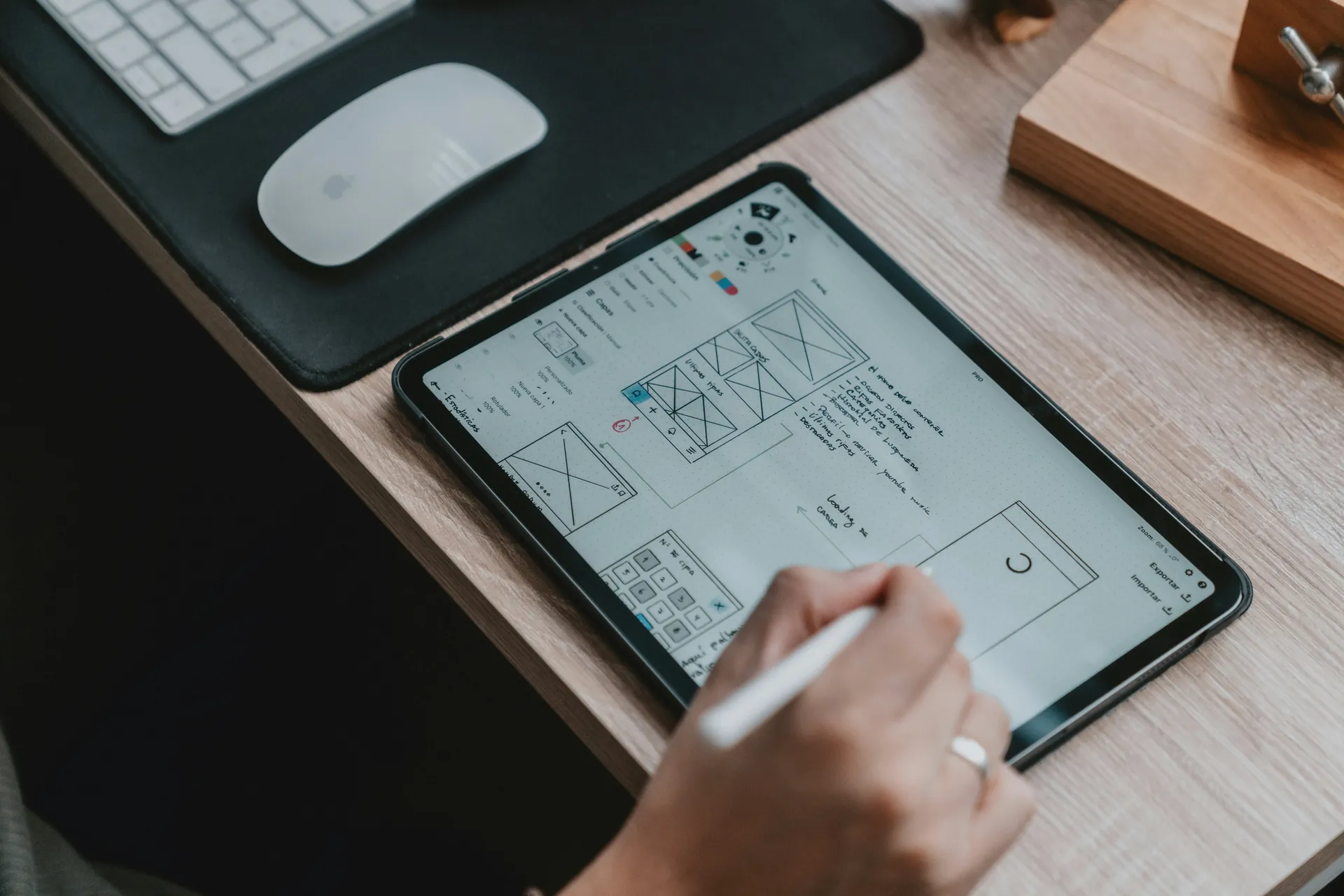
A one-page website gathers all of a site's content onto a single page. Its defining trait is linear navigation: visitors reach each section by scrolling, or by clicking anchor links that jump them down the page. Because everything lives in one place, the format simplifies the user experience and keeps browsing fluid.
A typical one-page site is built from clearly separated sections: solutions, about, testimonials, offers, contact. Each section is organised for clarity and readability, often with visual devices such as tables, charts or button groups that give the text and figures a structure the eye can follow.
How technology changed the format
Technical progress has reshaped both the design and the popularity of one-page sites. Modern tools such as Webflow, Wix and WordPress make these sites far easier to build and maintain without advanced coding skills. A specialised Webflow agency can take that further and tailor the design to a specific market.
These platforms ship pre-built templates and intuitive features that make it possible to produce an attractive, high-performing one-page site quickly. Better web performance and a stronger focus on user experience (UX) have made the format more appealing still. Modern techniques keep content loading fast and navigation smooth, even when a single page carries a great deal of information.
Where one-page sites are used
One-page sites are used across a wide range of sectors, for their simplicity and their efficiency. In business, they often serve as brochure sites that present products or services concisely and persuasively.
For portfolios and artists, the format offers an ideal way to display work in a linear, visually driven sequence. For events and marketing campaigns, one-page sites are particularly effective at communicating key information and pushing visitors toward one specific action, such as registering for an event or contacting the company.
That focused, minimal approach maximises the impact of the message while making it easier to turn visitors into potential customers.

Benefits of one-page sites for users and businesses
Simple, intuitive navigation
For users, simplicity wins. The linear structure of a one-page site makes navigation natural: content is discovered by scrolling vertically, with no repeated clicks and no page reloads. That cuts distraction and holds attention, which matters more as average attention spans keep shrinking.
On mobile devices, where scrolling is already instinctive, the approach makes even more sense. The mobile-first design of one-page sites delivers a consistent, well-optimised experience and builds visitor satisfaction.
Direct, efficient communication
For businesses, a one-page site is a chance to land a clear and forceful message. It condenses the essentials, services, products, testimonials, calls to action and contact details, into a single coherent flow you control from top to bottom.
The format suits:
- Start-ups that need to make a strong impression at launch.
- Small businesses looking to keep maintenance and development costs down.
- Event-driven projects such as launches, conferences and marketing campaigns.
By concentrating attention on a few key messages, one-page sites lift engagement and make quick actions easier: getting in touch, subscribing to a newsletter, buying online.
One-page sites versus multi-page sites
| Criterion | One-page site | Multi-page site |
|---|---|---|
| Navigation | Fluid and intuitive, driven by scrolling | More complex, hierarchical |
| Content | Concise and synthetic | Room for exhaustive detail |
| Maintenance | Quick and simple | Heavier and more regular |
| SEO | Harder to optimise | Precise targeting page by page |
| Best suited to | Start-ups, event projects, landing pages | Large companies, e-commerce, editorial sites |
| Cost | More affordable | Higher investment |
Technical and SEO challenges to solve
Load time and performance
One of the main technical challenges of a one-page site is load time. Piling a lot of content onto a single page raises the risk of a slow site, which hurts both the user experience and search rankings.
Modern answers to that include:
- Lazy loading, so images and sections load only as they are needed.
- Minifying resources (HTML, CSS, JavaScript).
- Optimising media, with WebP images and compressed video.
These are no longer optional if you want a competitive loading speed.
SEO limits and keyword targeting
SEO on a one-page site has its own constraints. Without multiple dedicated pages, ranking naturally for several keywords becomes difficult. On a multi-page site each page targets a precise keyword with content built around it; a one-page site has to compress several topics into a single URL.
To work around that limit, an SEO strategy should include:
- Optimising internal sections with a proper heading structure.
- Using anchor links so the page behaves a little like a multi-page site in search results.
- Writing rich content with a clear hierarchy (H1, H2, H3).
- Adding structured data so search engines understand the page better.

Examples of one-page sites worth studying
Real estate: The Rafael and The Julian
In real estate, The Rafael and The Julian build immersive experiences around their properties, with striking photography, virtual tours and cultural storytelling about the surrounding neighbourhood. The narrative approach deepens the emotional pull for prospective buyers.
Restaurants: Yantra
The site for the restaurant Yantra goes well beyond listing a menu. A full-width gallery and restrained animation drop visitors into the atmosphere of the room and give them a foretaste of the meal.
Consumer products: Fiome
Fiome, a natural and organic products brand, combines detailed nutritional information, brand storytelling and an embedded blog inside an optimised one-page structure. A clean design in dominant greens carries the message of health and sustainability.
What the sector examples have in common
The strongest one-page sites stand out across very different sectors, each adapting the format to its own audience. In real estate, The Rafael and The Julian illustrate the pattern well. The site presents a modern property in a quiet New York neighbourhood, with striking illustrations and detail on the floor plans, the amenities and the historical and cultural context of the area.
That approach fuses brand identity with attractive design to produce an online presence that feels both fresh and persuasive. In hospitality, Yantra stands out by selling atmosphere and feeling rather than dishes. A full-width gallery of interior photography and a user-centred layout with a tab per menu section make navigation intuitive and pleasant.
In consumer products, Fiome is a notable case. Its site takes an informative, user-first approach, with ingredient breakdowns, nutritional information and blog articles on health and wellbeing. The clean design and its dominant green reflect the brand's commitment to natural, vegan and organic products.
How new technology shapes the designs
New technology has changed one-page design considerably. Widespread use of animation, parallax scrolling and motion effects makes immersive, dynamic experiences possible.
The site Enjoy, for instance, combines graphic design and motion design with parallax effects to produce a visual experience that is pleasant rather than overwhelming. Halo uses animation and parallax with restraint, guiding visitors toward the actions that matter without cluttering the interface. Website builders such as Wix offer features like Strips and Columns for designing responsive, full-width elements. The site of Sonja van Duelmen shows what those tools can do, mixing animation, galleries and playful typography.
How audiences have responded
The response to well-made one-page sites has been strongly positive. Users value the linear navigation and the concise presentation of information, which cuts distraction and improves their experience.
One-page sites are particularly appreciated on mobile, where scrolling is a natural and instinctive gesture. Sites that add interactive and visually attractive elements, such as illustration and animation, are received especially well. Those elements do more than improve the aesthetics: they aid comprehension and raise engagement.
In short, the best one-page sites represent a successful adaptation to how modern users actually behave, offering a web experience that is both smooth and compelling.

Conclusion
To sum up, one-page sites are an effective way to present information concisely and hold a visitor's attention. They simplify navigation, improve the user experience, and suit businesses and projects that need clear, focused communication.
Their main advantages are linear navigation, better engagement and simpler maintenance. They do raise technical and SEO challenges, but those can be solved with the right optimisation. As new technology keeps improving and designs keep adapting to user preferences, the format continues to gain ground.
If you are weighing this format, it is worth prototyping: a one-page site is quick to test and easy to iterate on, which is exactly what makes it a good fit for a launch or a campaign.
FAQ
What are the main advantages of a one-page site over a multi-page site?
The main advantages are simpler navigation and a smoother user experience. All the content sits on a single page, which reduces load steps and improves engagement. Maintenance is easier, with only one page to manage, and the design can be far more immersive and narrative.
Which projects or companies are best suited to a one-page site?
One-page sites work well for projects and companies that need a concise, focused presentation. They are ideal for product launches, marketing campaigns, personal portfolios and online CVs, and for small businesses or start-ups that want to get their message across quickly without burying visitors in information.
How does a one-page site improve the user experience, especially on mobile?
A one-page site improves the experience through fluid, intuitive navigation that is particularly well suited to mobile. Its linear design allows continuous scrolling and removes the clicks and page transitions in between. That makes information easier to find and improves usability, while animation and parallax scrolling keep the experience visually engaging.
What are the drawbacks of a one-page site, and how do you work around them?
One-page sites can create SEO difficulties, because targeting specific keywords and tracking engagement are both harder. Load times can also be longer given the amount of content on a single page. And poorly organised content can leave the experience confusing.
To work around all three, structure the content into clear sections, optimise loading speed, and use analytics to understand how visitors actually behave. Creating dedicated sub-sections for specific topics can improve the experience and strengthen the SEO strategy at the same time.
Synqro's latest achievement