
{{text}}
Share
Designing or updating your website can be a real challenge, but with the help of a Webflow expert, the Webflow layout becomes a formality. This powerful no-code web design tool allows great flexibility in creating and managing websites, transforming your ideas into a captivating and aesthetically pleasing user experience.
Webflow makes it easy to create custom sites, like blogs, online stores, and more, without coding. With customizable templates and templates, plus collaboration and content management tools, Webflow makes developing and updating sites simple.
This guide explores Webflow layout, key elements, tools to improve your designs, how to avoid mistakes, adapt your site to all devices, and optimize SEO and performance. Ready for web design with Webflow? Let's start this journey towards exceptional layouts.
The basics of layout in Webflow
Why choose Webflow for your layouts?
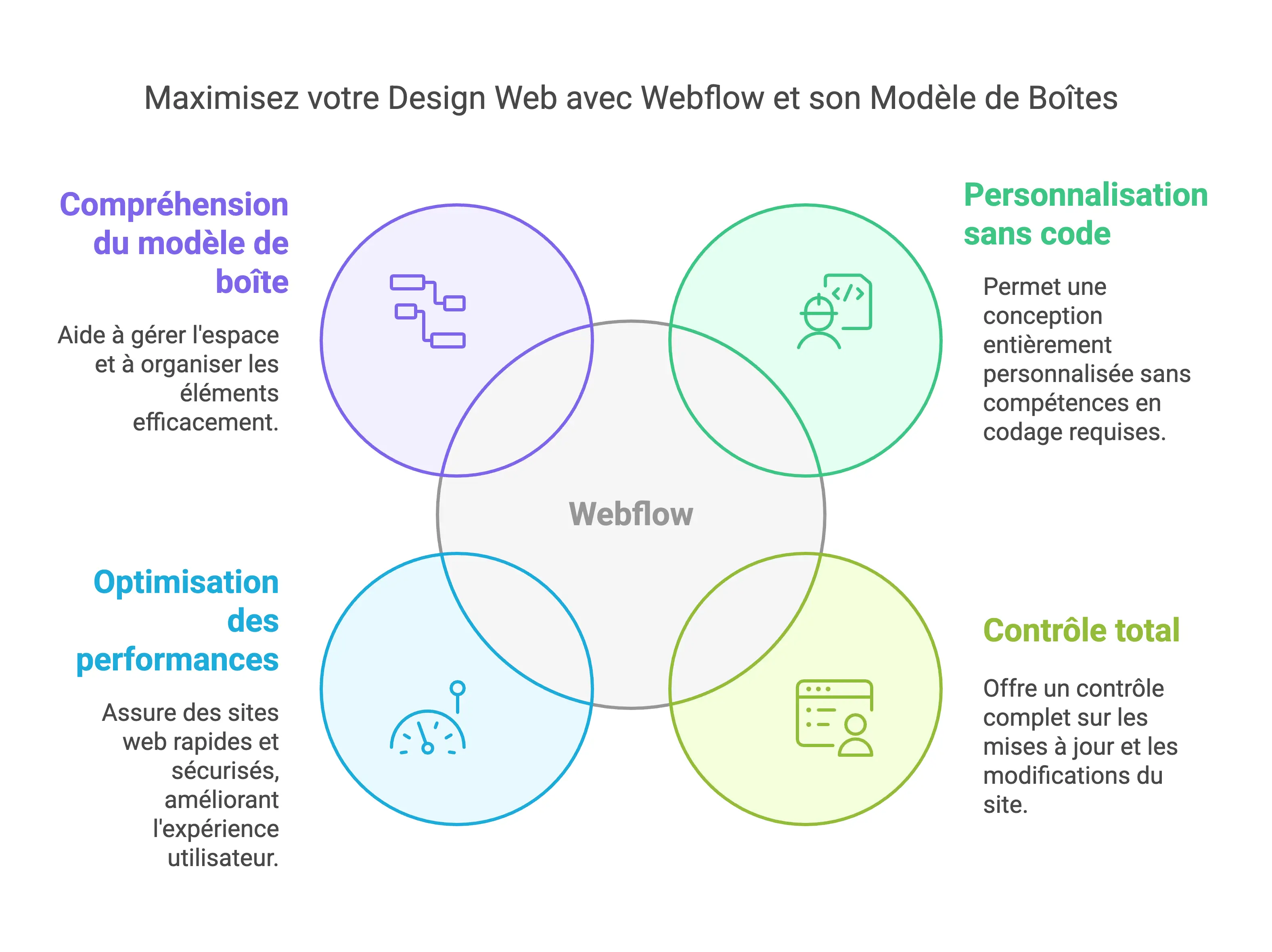
Webflow is distinguished by several key advantages, making it essential for the design of web layouts. Its ability to offer complete customization without the need for coding is particularly appreciated.
It allows you to create fully customized websites that align perfectly with your visual identity and brand goals, helping you stand out from your competitors.
Webflow gives you total control over your site, facilitating quick and intuitive updates without having to rely on third parties. This allows you to change content, images, and design elements in a few clicks, an essential advantage for a dynamic and up-to-date online presence.
Optimized for performance and security, Webflow ensures fast and lightweight websites, improving user experience and SEO. Webflow's “Core Web Vitals”, which measure page load time, responsiveness, and visual stability, often outperform those of competitors, boosting your online visibility.
Understanding the box system (box model)
Understanding the box system, or “box model”, is essential for layout on Webflow. This template structures an HTML element in terms of margins, borders, padding, and content. Visualizing each item as a box made up of these components simplifies space management and organization of items on the page.
This system allows you to precisely control the width, height, margins, margins, borders and padding of each element, essential for creating a harmonious and responsive layout. Webflow's visual tools make it easy to adjust these parameters, making the design more intuitive.
By mastering the box system, you can easily create complex, custom layouts without writing a line of code. This flexibility and precision make Webflow a powerful tool for web designers.
The essential layout elements (Layout Elements) on Webflow
Section: The starting point for any layout
Sections are essential in Webflow, functioning like chapters in a book to organize content in a structured way. They stack naturally and can take up the entire width of the browser window, making it easy to create distinct and harmonious blocks of content.
Customizing elements within a Section is easy thanks to the modification of its properties, even allowing the activation of 3D perspective effects for its contents.
Container: Manage content in a fixed width
Containers are essential to contain elements within a defined width, ensuring uniformity in the presentation of content on your page. They are ideal for framing text, images, videos, and more by controlling their width and positioning, which contributes to a balanced and structured layout.
Grid: Create flexible and complex layouts
Grids offer flexibility and layout complexity that is unmatched in Webflow. They allow you to position items in cells organized by columns and rows, with the possibility of customizing their configuration. This structure acts as a guide for precise and adaptive positioning of elements, optimizing the display on various devices.
Columns: Organize your content into responsive columns
Columns are essential for responsive content organization. With Webflow, it's easy to create columns, customize them in width and layout. They are integrated into lines, facilitating the management of the layout. Alignment and positioning settings per device ensure a smooth user experience on all screens.
The basic elements for your Webflow pages
Div Block: The basis for organizing your content
The Div Block is essential in Webflow for structuring and styling content in a flexible container. It can include various elements such as text, images, buttons, and other Div Blocks, making it easy to create a clear and maintainable HTML structure. With the ability to customize the style via CSS, you can adjust the appearance and layout of the included elements, such as width, margins, paddings, backgrounds, and borders.
List and List Item: Organize your lists
List and List Item elements are vital for creating structured and accessible lists in Webflow.
Use `tags
- `,`
- `, and "for unordered, ordered, or defining lists. List items (`
- `) may include text, images, links, and more, providing flexibility in presentation. They are also essential for accessibility, allowing for improved navigation for users with specific needs.
Link Block: Add clickable areas to your pages
The Link Block enriches your Webflow pages with clickable areas, ideal for linking blocks of content such as images or text. This simplifies navigation by allowing users to click on larger areas. Links can lead to internal pages, specific sections via anchors, external sites, or email addresses.
Button: Create engaging buttons
Buttons play a key role in encouraging action on your site. Webflow allows you to create custom buttons, with a variety of style options such as font, size, letter spacing, as well as background and text colors. It is possible to configure different states (normal, hover, pressed) to improve the user experience through immediate visual feedback. The buttons can be reused to ensure a consistent style across the site.
Structuring content with typographical elements
Heading: Organize your titles for a visual hierarchy
Headings play a critical role in creating a clear and structured visual hierarchy for your content. Using HTML tags H1 unto H6, Webflow allows you to define different levels of importance for your titles. These elements make it easy to navigate and understand the structure of your page, as well as being important for SEO, by signaling priority information on your page to search engines.
Customizing the styles of your titles, by adjusting aspects such as font size, line height, font family, and color, is easy. It is advisable to establish global styles for your titles via CSS, thus ensuring a uniform design across your site.
Paragraph: Add and style text blocks
Paragraphs are the fundamental element of your site's textual content. With Webflow, adding and customizing paragraphs is simplified thanks to the element Paragraph. Defining global styles for your paragraphs, including font size, line height, font family, and color, ensures visual consistency and improves the readability of text on your site.
By adjusting the margins and spacings (padding), you optimize the spacing and readability of your texts. The use of relative units like Rem for these measurements ensures better adaptability and consistency across various devices.
Rich Text Element: A powerful tool for complex content
The Webflow Rich Text Element is ideal for easily managing complex content. This component allows you to integrate a variety of content, such as titles, paragraphs, lists, and images, into a single element.
Its ease of use, allowing content to be added and edited directly by a simple double-click, makes creating dense pages, such as blog articles or biographies, particularly easy. For collaborators, this feature greatly simplifies the editing of rich content without requiring the addition of individual elements. Customizing this content through specific classes and style adjustments provides greater flexibility and customization.
Advanced tools to optimize your Webflow layouts
Advanced Grid: Maximizing Design Possibilities
The advanced Grid in Webflow is a powerful tool that allows you to create complex and flexible layouts. This grid system allows you to distribute items into cells defined by columns and rows, providing great flexibility in the layout of items.
You can configure the number of columns and rows, as well as the direction of element flow, making it easy to create responsive designs that adapt perfectly to any screen size.
With Advanced Grid, you can also define custom grid areas, adjust cell spacings, and use advanced features like auto-placing items. This makes it possible to create dynamic and interactive layouts, ideal for modern and immersive websites.
Flexbox: A powerful alternative for your alignments
Flexbox is another advanced Webflow feature that offers great flexibility in the alignment and layout of elements. By activating Flexbox mode on a parent element, you can precisely control the alignment of child elements. You can align child elements horizontally or vertically, and choose from a variety of alignment options such as “Start,” “Center,” “End,” “Space Between,” and “Space Between,” and “Space Around.”
In the Webflow style panel, you can adjust the alignment of Flexbox elements using the “Align” option, which includes a 3x3 grid for quick alignment. The alignment options vary depending on the direction of the Flexbox (horizontal or vertical), allowing for great precision in the arrangement of the elements.
Plus, you can use automatic margins to align Flexbox elements, which adds another layer of flexibility to your design.
Flexbox is particularly useful for creating responsive and adaptive layouts, as it allows elements to be easily managed in various screen-size contexts, without requiring complex coding.
Responsive: Adapt your layout for all devices
Understanding breakpoints in Webflow
Breakpoints are essential to ensure that your website adapts perfectly to different screens in Webflow. They define the specific screen widths where your design should fit, covering devices like desktops, tablets, and smartphones in landscape and portrait modes.
In the Webflow interface, you can easily visualize and adjust your design according to these breaking points. They allow you to create styles adapted to each device, by adjusting text size, spaces, and even the visibility of certain elements. So, a site that displays three columns on a computer can switch to a single column on a smartphone in portrait mode, providing a smooth user experience across devices.
Mobile-first optimization: An essential approach
Adopting a mobile-first approach is essential to develop responsive and effective websites. This strategy involves prioritizing optimization for mobile devices, focusing first on key features and intuitive navigation on smaller screens, before expanding the design for larger screens.
By starting from mobile, you ensure that your site is lightweight, fast, and easy to use on mobile devices, where the majority of Internet traffic is found today. This method includes simplifying navigation, optimizing images, and usability testing to ensure the site works well on all devices.
In addition, mobile-first promotes gradual improvement: start with the basic elements that are effective on mobiles and tablets, then enrich the design and functionalities for larger screens. This approach ensures a consistent and high-quality user experience across devices, a key aspect for the success of your website.
Webflow components to enrich your Webflow layouts
Navbar: Structuring the navigation of your site
The Navbar, or navigation bar, plays a key role in organizing navigation on your website. With Webflow, it is possible to create a custom Navbar, integrating elements such as links, buttons and drop-down menus.
It can be positioned at the top or bottom of your page and configured to adapt to different screen formats, thus ensuring smooth navigation for the user, regardless of the device used.
Enrich your Navbar with advanced features such as hamburger menus for mobile versions, submenus, and anchor links for precise navigation to specific sections of your page. Personalize it by adjusting styles, colors, and fonts to perfectly match your brand's visual identity.
Tabs: Add tabs to organize your content
Tabs, or tabs, are ideal for structuring and presenting your content clearly. Webflow allows you to integrate Tabs to group similar content under separate tabs, optimizing the space available on the page while improving the user experience.
Each tab can show various types of content, such as text, images, or videos, and the user can easily navigate between them. Customize the look and function of your tabs, choose the active default tab, manage tabs, and configure animations for a smooth transition between content.
Tabs are particularly useful for displaying information such as prices, product characteristics, or customer reviews in an organized manner.
Slider: Highlight your content with a carousel
The Slider, or carousel, is a captivating visual element that enhances your content dynamically. Thanks to the Webflow Slider component, equipped with navigation arrows, indicator points, and an autoplay option, you can create attractive presentations.
This component is fully adaptable and responsive, guaranteeing perfect integration on all screens and touch devices.
Set up animations, smooth transitions, tactile navigation, and autoplay to captivate your audience. The Slider is perfect for showcasing images, videos, or other content interactively, often used on home pages, product pages, or landing pages to draw attention and present key information in an engaging way.
Common layout mistakes to avoid
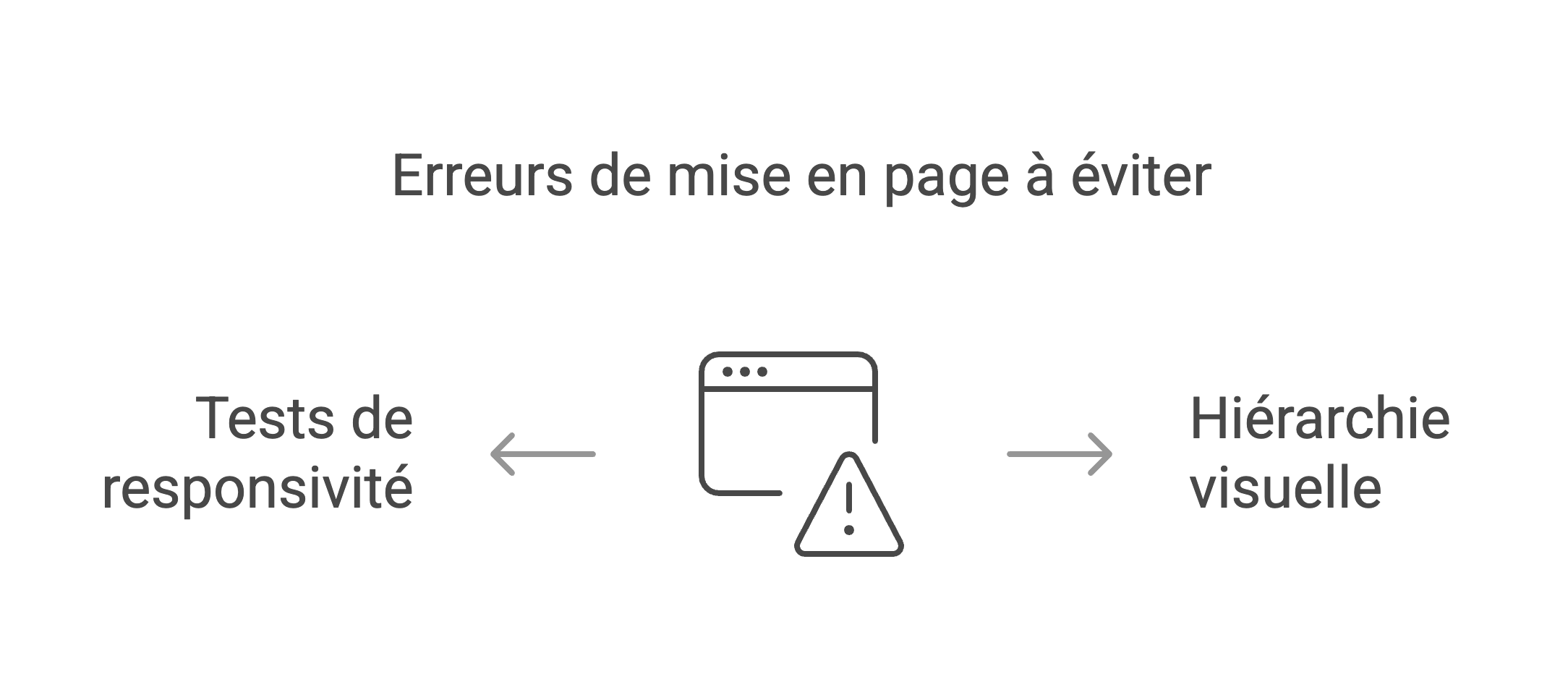
Ignore the visual hierarchy
A major mistake to avoid is neglecting visual hierarchy. It plays a critical role in directing user attention and strengthening engagement.
It allows design elements to be ranked in order of importance, providing a user experience (UX) that highlights key elements like buttons, images, or text that you want users to interact with.
Ignoring the visual hierarchy can make your web page confusing and complicated to navigate, increasing bounce rates and reducing user engagement. To avoid this, apply visual hierarchy principles like size, color, position, and contrast to establish a clear and intuitive structure in your design.
Do not test on all devices
Another common pitfall is not testing your layout across devices and screen sizes. Responsiveness is essential to ensure seamless functionality on desktops, tablets, and smartphones. Not doing these tests can lead to layout issues, misarranged elements, and a degraded user experience.
Use Webflow's test tools to simulate various screen sizes and devices. Also, test your site on real devices to make sure everything is working properly.
This includes checking margins, paddings, images, and interactive elements to ensure a smooth user experience across devices.
Optimize your layouts for SEO and performance on Webflow
Improve load times
Improving the load times of your Webflow site is essential for SEO and user experience. Slow loading can increase the bounce rate, reduce the number of visitors, and decrease the conversion rate. Several strategies can be used to optimize loading speed.
Resizing and compressing your images is an effective method. Use tools like ILoveIMG to reduce image size without compromising image quality. Select the appropriate image format for each use; JPEG is best for photos, while SVG is better for logos and icons, ensuring the highest quality at all scales.
Postponing the loading of non-essential scripts is also essential. By using the `defer` attribute in your custom code before the `src` tag, you allow the browser to load the page and the script simultaneously, which speeds up the process. Additionally, minimizing JavaScript and CSS files by eliminating superfluous characters and elements can also improve loading speed.
It is recommended to use the Webflow cleaning tool to eliminate unnecessary styles, classes, and animations, thus reducing file weight and improving page load time.
Add alt tags and descriptions
Incorporating alt tags and descriptions into your images is essential for accessibility and SEO. Alt tags provide a textual description of images, making it easier for search engines to understand the content of your page and improving accessibility for users with specific needs.
In Webflow, you can add alt tags in a variety of ways. Configure the alternative text directly in the image settings, using the “ALT text from asset” option or by customizing this option with a specific description. If you use the Webflow CMS, you can also extract alternative text from CMS fields, simplifying content and metadata management.
In addition to alt tags, adding descriptions to other elements on your page, such as meta titles and meta descriptions, is essential for SEO. Webflow offers integrated tools to facilitate the addition of this metadata, allowing search engines to properly index your content and improve your visibility in search results.
Conclusion: Build exceptional layouts in Webflow
Summary of best practices
To create great layouts in Webflow, adhere to several core practices. First, choose a simple and clean design, avoiding cluttering the page with too many elements and functionalities.
This approach improves readability and navigation, making the user experience more enjoyable and engaging. Ensure that your site is fully responsive, using grids and flexboxes so that your layout fits all screen sizes. Intuitive navigation is also essential; opt for pull-down menus, fixed navigation bars, and explicit navigation buttons to simplify user navigation.
Improve the loading speed of your site by choosing optimized images, reducing the number of HTTP requests, and by activating the cache and the minification of CSS and JS. Limit unnecessary redirections and prioritize lazy loading for secondary content.
Finally, be sure to add alt tags to your images and maintain a clear visual hierarchy to direct users' attention. These practices, in addition to improving the user experience, also optimize the performance and SEO of your site.
Resources to go further with Webflow
To refine your web design skills with Webflow, several resources are available to you. Webflow University is a fantastic free platform offering a vast collection of video tutorials, covering everything from fundamental aspects to more complex functionalities.
The Webflow forum is also a great source of inspiration and advice, thanks to the Webflow designer community. For free UI templates and kits, explore Tenten or Lottieflow's suggestions for animations.
In-depth guides provided by Insistudio and Ouiflow can help you boost the performance of your site, with tools like Google Lighthouse and by following specific design approaches like the “Client-First” methodology.
Finally, integrating third-party tools such as Jetboost for real-time search and filtering, or Memberstack to develop sites with subscriptions, will enrich the functionalities of your Webflow site.
This ultimate guide to Webflow layout has provided you with all the tools and knowledge you need to design remarkable websites. Synqro, at the forefront of Webflow agencies in France, is the ideal partner for your Webflow site creation or redesign projects.
Thanks to their certified expertise, Synqro skilfully combines design, development and marketing to offer a seamless user experience, while optimizing SEO to effectively transform your visitors into customers.
Do not wait any longer to turn your ideas into digital projects. Contact Synqro today to benefit from a personalized strategy and adapted solutions that will meet your expectations. With Synqro, boost your sales and significantly strengthen your online presence.
Synqro's latest achievement