{{text}}
Share
Chez Synqro, Webflow agency, we design sites that are optimized for all screen formats. Our priority: to guarantee a smooth user experience thanks to a responsive website built with Webflow. As early as 2026, the majority of brands require platforms that can adapt the layout without technical complexity. This is precisely what Webflow allows: create a coherent, fast site that is aligned with the standards of Responsive design.
According to StatCounter 2025, more than 58% of global traffic comes from mobile, which requires a flexible architecture. The choice of a webflow website meets this requirement, because Webflow offers a intuitive visual environment allowing create a responsive website without superfluous code.
Why is a responsive website designed with Webflow essential in 2026?
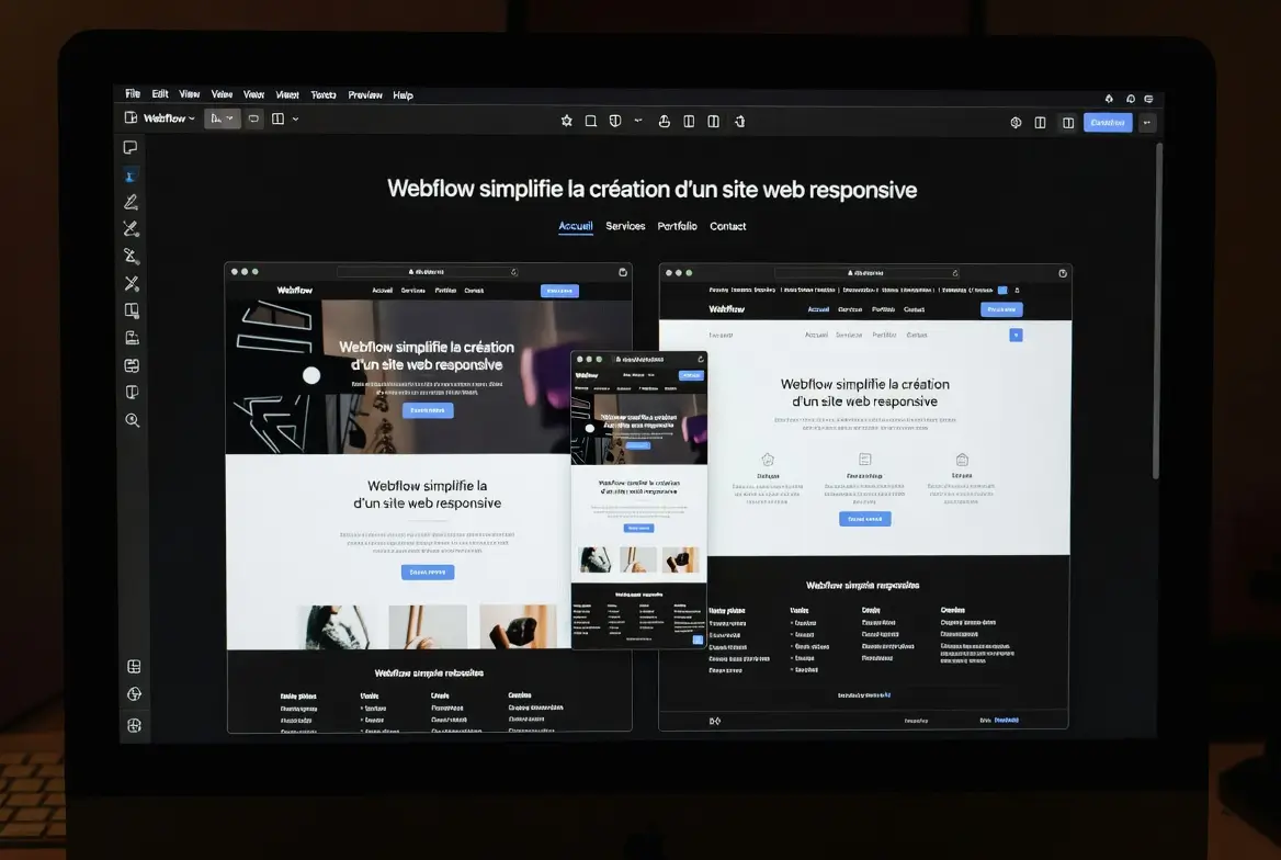
A site must adapt automatically to different types ofscreen, from desktop to mobile. Webflow simplifies this logic thanks to its predefined breakpoints. As soon as the project is opened, the platform displays the desktop, tablet, mobile portrait and mobile landscape variants. This means that styles evolve dynamically according to the size of the user's screen.
A responsive website designed with Webflow is a site whose display is automatically reorganized according to the resolution, guaranteeing a smooth experience on all devices.
This flexibility has a direct impact on conversions: a Google 2024 report indicates that 53% of visits leave a site if the mobile structure is slow or poorly adapted. Webflow provides a solid foundation, optimized for performance and ergonomics.

The key benefits
- Adaptability : each layout is readjusted.
- Visual coherence : standardized fonts, spacing and styles.
- Compatibility : display optimized for all screen resolutions.
- Time saver : integrated responsive management.
How does Webflow simplify the creation of a responsive website?
Webflow works in No code, while generating a CSS code clean and in accordance with standards. The platform automatically applies styles from desktop to smaller formats, while allowing specific adjustments.
Webflow offers a visual system allowing styles, layouts, and interactions to be managed centrally for all devices, without directly manipulating media queries.
This logic is based on three structuring elements:
- Flexbox to organize each section,
- Grid to structure complex layouts,
- Global styles to define total consistency.
At Synqro, we are seeing an average 30% reduction in responsive integration time thanks to these features. The ability to preview each format avoids technical back-and-forth.
The essential levers
- Flexbox : fluid organization.
- Grid : structured layout.
- Global styles : design coherence.
- Adjustments per device : better precision.
What are the essential breakpoints to make your site responsive on all devices?
Breakpoints are essential for structuring a responsive site. Webflow integrates them natively, which makes it easy to build.
Webflow breakpoints allow the design to be adapted to the main screen resolutions, guaranteeing an optimal user experience on all devices.
Integrated responsive HTML table
To remember
- Desktop : main graphic base.
- Tablet : structural realignment.
- Horizontal mobile : limited adjustments.
- Vertical mobile : maximum ergonomics.
How to optimize content in Webflow to ensure a smooth user experience?
One responsive website is not limited to breakpoints. Content must also be adjusted: images, fonts, spacing and interactions.
Responsive optimization in Webflow consists in adapting each element to maintain constant readability and performance on all devices.

Webflow makes it easy to:
- the management of images in adapted formats,
- viewport unit settings,
- adjusting the margins according to screen sizes,
- the deactivation of heavy effects on mobile.
Synqro data shows that a site whose images are optimized reduces on average 40% of its total weight, which significantly improves loading time.
The essential levers
- Compressed images : fast charging.
- Fluid fonts : better readability.
- Dynamic spacings : coherent design.
- Adapted components : controlled mobile ergonomics.
How does Webflow organize CSS styles for a more reliable responsive?
Webflow applies a visual hierarchical system similar to that of traditional CSS. Each style follows a logical cascade, which avoids inconsistencies.
Webflow prioritizes styles to apply, modify, or overload the appearance of a component according to the type of screen, while maintaining a clean CSS architecture.
This approach includes:
- The Classes,
- The Combo classes,
- The HTML tags,
- The global styles.
Interactions can also be conditioned by Viewport, which makes it possible to limit animations on mobile, as recommended by Google Lighthouse.
The key axes
- Visual waterfall : mastery of styles.
- Advanced combinations : fine control.
- Adapted interactions : mobile performance.
- Global styles : general harmonization.
Webflow or WordPress: which is the most reliable for responsive?
For a responsive website, Webflow offers a more direct approach than WordPress, often depending on themes and plugins.
Webflow is more suitable for creating a responsive site thanks to a native responsive, advanced visual design and an optimized structure without a plugin.
Comparative table
Why entrust your project to Synqro?
To date, Webflow offers one of the most robust environments for developing an adaptable site. At Synqro, we use these features to provide efficient rendering on all screen sizes.
Do you want to create a responsive website with Webflow? Contact Synqro for a personalized quote.
FAQS
How to make a Webflow site responsive?
A Webflow site becomes responsive by using integrated breakpoints and adaptive styles. Webflow automatically adjusts the layout according to each screen. The approach consists in designing the desktop structure and then adapting the tablet, mobile landscape and mobile portrait versions. Global styles ensure visual consistency. The images must be optimized and the spacings adjusted to offer smooth ergonomics. Synqro also uses relative units to maintain consistent readability. The result is a site that is optimized for all devices and meets modern performance requirements.
Does Webflow automatically manage media queries?
Yes, Webflow automatically manages media queries by creating predefined breakpoints in the editor. Each change that is applied to an element can be adjusted for a specific type of screen. This eliminates the need to write manual CSS code. Desktop styles are carried over to smaller formats, except in case of customization. Webflow also offers an instant preview to validate each variant. This automation accelerates production and guarantees reliable responsiveness, even on complex projects.
Is it possible to customize a site differently for mobile and desktop?
Yes, Webflow allows independent customization according to the type of screen. You can change the size of the texts, adjust the margins, reorder blocks or hide certain elements on mobile. Interactions can also be deactivated to reduce the load. This adaptability makes it possible to design a clear and fast mobile experience. The visual editor facilitates this work by immediately displaying the impacts. Synqro uses these features to create optimized mobile versions that respect Google best practices.
Is Webflow better than WordPress for responsive?
In most cases, Webflow offers a more reliable responsive, because it is natively integrated. WordPress is based on themes or constructors, which are often limited. Webflow produces clean code and a consistent structure for all devices. The performances are generally better, as shown by the Lighthouse scores obtained on our projects. WordPress remains relevant for some complex backend needs, but for flexible design and multi-screen ergonomics, Webflow clearly dominates.
How much does a responsive site created with Webflow cost?
The cost depends on the design, content, and level of interactions. On average, a professional site starts at a few thousand euros. Webflow adds a hosting cost between €14 and €39 per month depending on the plan chosen. The investment covers design, integration, responsive adjustments, multi-screen testing and performance optimization. Synqro provides quotes tailored to specific needs and brand goals. The result is a clear, fast site that is perfectly adapted to different devices.
Synqro's latest achievement