
{{text}}
Share
One Graphic charter, or “brand guidelines,” is a key document for any business. It defines the rules for the use of visual elements that make up its graphic identity, such as the logo, colors, colors, typography, images, iconography, and editorial tone and voice.
Its main objective is to ensure a visual coherence on all communication media: websites, social networks, brochures, posters, and other marketing tools. This consistency reinforces the identity of the brand and its recognition among the public.
In this article, discover the essential components of a graphic charter, its strategic role in the communication of a company, and concrete examples of successful graphic charters. Whether you are a designer, marketing professional, or interested in Top Branding Agencies, this guide will help you better understand its impact on your brand image.
Definition and essential components of a graphic charter
What is a graphic charter?
One Graphic charter is an exhaustive document that formalizes the rules for using a brand's visual elements. It is essential to guarantee a coherent visual identity and recognizable, regardless of the media used, whether digital or printed. This guide allows the company to maintain constant and structured communication, defining graphic standards for all its representations.
The key elements of a graphic charter
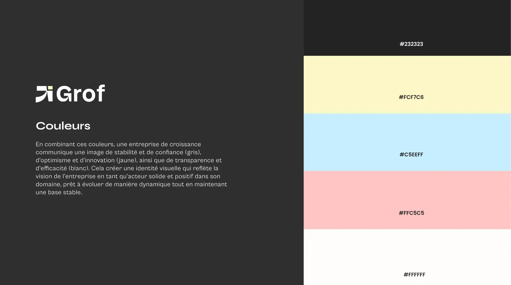
The components of a graphic charter include fundamental visual elements such as:
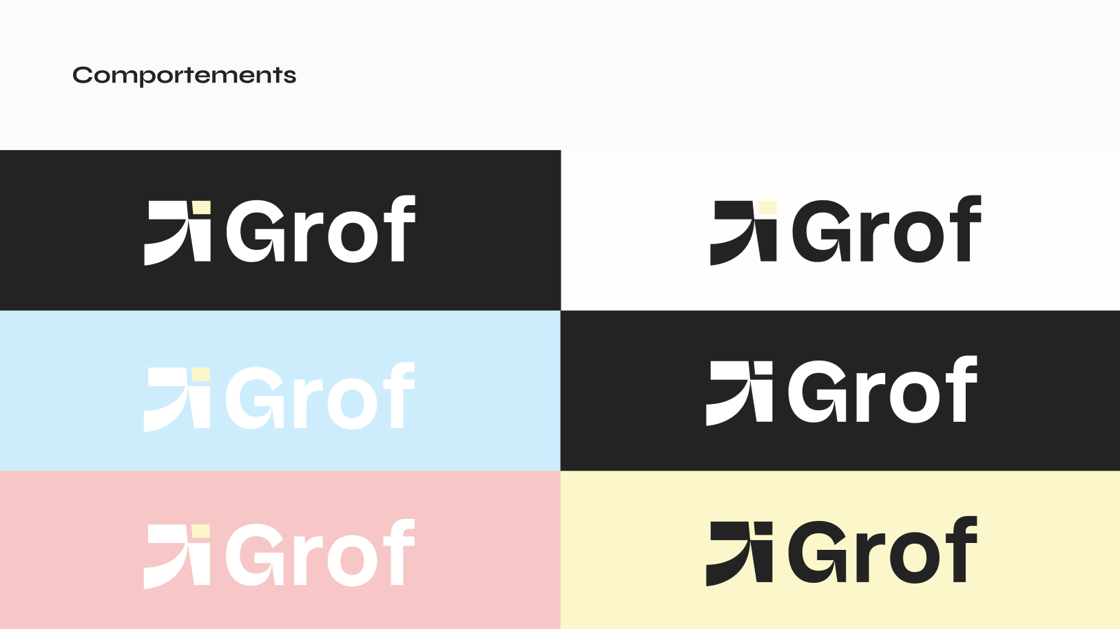
- The logo : its structure, its variations and its authorized versions.
- The color palette : color codes (RGB, CMYK, HEX) and their acceptable associations.
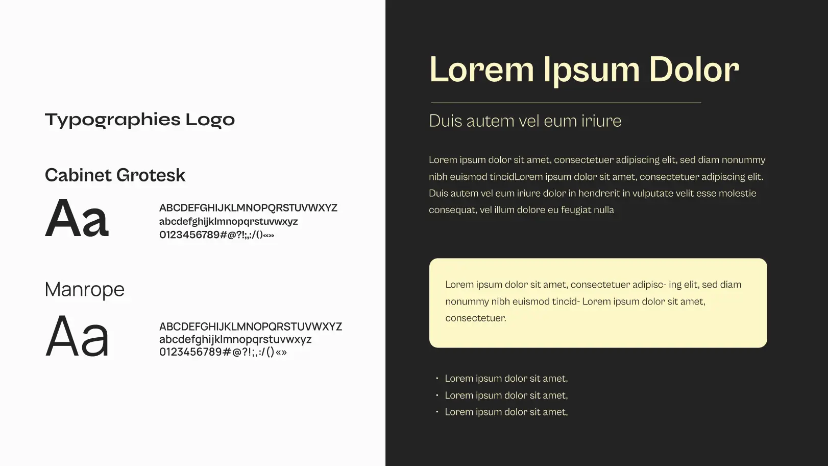
- The typefaces : main and secondary fonts, sizes, styles (bold, italics, etc.).
- Iconography : image processing, symbols and icons.
- Margins and spacings : alignment and layout guidelines.
- Editorial tone : written language and voice used to communicate.
These elements, formalized in the charter, ensure a graphic coherence and make it easier for the public to remember the brand.
Importance and use of the graphic charter
Why is it crucial to have a graphic chart?
Having a graphic chart is essential for several reasons:
- It guarantees a coherent visual identity on all communication media, whether digital or printed.
- It reinforces the notoriety and makes it easier for the public to remember the brand, especially since 65% of people have a dominant visual memory.
- It helps to valorize the brand and to differentiate it from the competition thanks to a strong and attractive visual identity.
- In businesses where several people collaborate on content creation, it serves as a guide to maintain a graphic stability, thus avoiding inconsistencies that could confuse customers.
Practical uses of the graphic charter
The graphic charter is an indispensable tool in a company's communication strategy. It is used for:
- Guide the creation of materials such as websites, social networks, brochures, posters, and other communication materials.
- Coordinate advertising campaigns, internal and external documents, as well as events or exhibition stands.
- Help marketing, design and communication teams to work in a Coherent, even in varied contexts.
- Provide new employees or external contractors with clear guide on how to visually represent the brand, facilitating their integration and alignment with company standards.
How to create an effective graphic charter?
Create a Graphic charter is not just about aligning visual elements: it is a strategic approach that requires a thorough reflection on the identity of the company, its target and its communication channels. Here are the key steps for designing a coherent and sustainable charter.
1. Brand analysis
Before starting the design, it is essential to lay the foundations:
- What is the mission of your brand?
- What are its values, its vision?
- What message should it send?
- What audience is it aimed at?
This strategic framework will serve as the basis for all graphic decisions, ensuring that the visual charter is aligned with the company's DNA.
2. Creation of the fundamental visual elements
This step includes creating or redefining the following items:
- Logo : main versions, monochrome alternatives, responsive variations.
- Color palette : primary, secondary, contrasts, with all codes (HEX, RGB, CMYK).
- Typography : main fonts for titles, secondary fonts for current texts, typographical hierarchy.
- Iconography and photographs : pictogram style, visual processing (filters, compositions).
- Layout : margins, grids, spacing, content structure.
3. Rules of use and concrete cases
La Graphic charter should include practical examples of implementation to avoid misinterpretations. Integrate:
- Typical media models (business card, Instagram post, newsletter).
- Responsive design guidelines.
- Editorial tone and voice recommendations.
Avoid common mistakes in a graphic chart
Even a well-thought-out charter can be weakened by some common mistakes. Here are the pitfalls to avoid.
A charter that is too rigid
One Graphic charter Too strict hampers innovation and adaptation to new formats. You have to think modularity : provide variants, flexibility margins for digital, event or international contexts.
Poorly-explained rules
A good charter is not just a visual document. She must Explain graphic choices clearly and contextualize them. A guide without justification or explanation of the “why” can generate inconsistencies in interpretation.
Forget the digital version
In the digital age, a Graphic charter must absolutely include:
- Specificities for the web design (accessibility, contrast, responsive, dark mode).
- Optimized versions of the logo for Retina screens.
- Guidelines for social networks and animations (GIF, video, motion design).
The evolution of a graphic charter over time
Contrary to popular belief, a Graphic charter is not fixed. It must evolve with the brand, its markets and its tools.
When should it be changed?
- Brand repositioning or target change.
- Evolution of graphic or technological trends.
- Merger, acquisition, or name change.
- New platform or major marketing channel.
In this case, the existing charter may be the subject of a complete rebranding or simply of a partial redesign.
Illustrative examples of successful graphics charters
Example of big brands
Several major brands have created graphic charts particularly exemplary and inspiring. Let's take the example of Coca-Cola, one of the most recognizable brands in the world. The Coca-Cola graphic charter is a real reference in terms of Branding.
It includes the famous “Spencerian Script” cursive logo, a well-defined color palette, and variations of the logo in various alphabets and formats. The charter also details specific elements such as the dynamic ribbon and the icon representing the outlines of a Coke bottle, illustrating a visual identity both assertive and coherent.
Another notable example is walmart, who designed a “Brand Center” including several detailed guides. These guides are not limited to the use of the logo and colors, but also cover strategic aspects such as brand mission, strategies, and marketing initiatives.
This holistic approach demonstrates how a graphic charter can go beyond simply describing visual elements to incorporate key aspects of global strategy of the company.
Finally, let's quote Louis Vuitton, a luxury brand that knew how to create a simple but refined graphic charter. It is mainly based on two colors: dark brown and light beige. These shades evoke quality, durability, and refinement, and are used consistently across all communication mediums, whether online or printed.
The iconic “LV” motif is also repeated filigree on the products, thus reinforcing the visual identity of the brand.
Impact of graphic charters on brand identity
Les graphic charts play an important role in a company's brand identity. They allow you to create an image Coherent and recognizable, essential to strengthen the reputation and trust of customers.
For example, the graphic charter of Spotify ensures that the brand is represented uniformly across all platforms, whether it's its mobile app, website, or advertising campaigns. This visual coherence contributes to making the brand more memorable and identifiable.
In addition, graphic charters facilitate internal and external communication by providing a common visual language for all teams involved in content creation. This reduces inconsistencies and errors that can damage the brand image. For example, Zendesk has set up a very advanced “Brandland”, which serves as a guide for all communication actions. This guarantees a visual coherence and a strong and easily recognizable brand identity, particularly useful when collaborating with a team of webflow experts in Paris.
At the end of the day, graphics charts are essential tools for building and maintaining a solid visual identity. They play a decisive role in the success and recognition of a brand on the market.
Conclusion
In summary, a Graphic charter Is a tool indispensable for any company wishing to maintain a coherent visual identity and easily recognizable. It guarantees a visual harmony on all communication media, reinforces the brand image and offers a competitive advantage by visually distinguishing the brand from its competitors. The essential elements of a graphic charter include the logo, colors, typography, and layout rules.
Examples of brands like netflix, starbucks and France Télévisions perfectly illustrate the positive impact that a well-designed graphic charter can have on a brand's identity.
If you have not yet developed a graphic charter for your business, it is time to take the lead. Define your visual elements, establish clear rules of use and ensure that all teams involved in creating content follow these guidelines. This will allow you to build a strong visual identity and memorable, an essential asset for the success and recognition of your brand.
FAQS
What are the strategic objectives of the new graphic charter for my company?
Les strategic goals of a graphic charter for your business include:
- Maintain a visual coherence across all communication media.
- Strengthen thebrand identity.
- Facilitate communication through clear guidelines.
- Accelerate the production of new supports while ensuring consistent quality.
This coherence allows a immediate recognition of your brand, while forging and consolidating its identity. It also conveys your values and your mission through carefully defined visual elements.
How does the new graphic charter align with my company's identity and values?
The new graphic charter is in line with theidentity And the values of your company by establishing precise visual rules that reflect its mission, founding values and objectives. Before it is designed, it is important to clarify:
- The mission of the company.
- Its main values.
- His main target.
This charter guarantees a coherent visual communication and homogeneous, which reinforces the trust and the recognition of your brand among your audience.
What is the importance of defining colors and fonts in a graphic charter?
Define the colours And the polices in a graphic chart is essential to ensure a visual coherence and a recognizable identity. This allows:
- To maintain consistency in all your communications.
- To strengthen the notoriety of your brand.
- To facilitate the memorizing by your audience.
A well-thought-out visual consistency also helps to differentiate your brand from the competition.
How to adapt the graphic charter to the various communication media (web, print, social networks)?
To adapt your graphic charter to the various communication media, it is essential to maintain a visual coherence using:
- The same color palette.
- The same fonts.
- The same logo.
These elements must be applied on all media, whether web, print or social networks. Also plan for specific guidelines for each support, such as:
- Image dimensions and resolutions adapted for the web and mobile applications.
- Alternative versions of the logo for optimal visibility in different contexts.
Synqro's latest achievement