
{{text}}
Share
Visual identity definition: Thevisual identity represents the graphic and visual footprint of a company. It includes all graphic elements distinctive such as the logo, the typography, the color palette, as well as others communication media visuals. Its objective is clear: to make the company easily identifiable and memorable to its patrons and of the public. It also reflects its values, its culture and its positioning in the market.
This identity takes shape in a strategic document called Graphic charter. This guide details the rules for using the various visual elements, thus ensuring coherent and professional visual communication. Whether they are publications on social networks, printed documents or digital media, the graphic charter guarantees an essential visual unity, responding to the definition of graphic charter described by professionals in the sector.
In short, visual identity is the graphic translation of a company's identity. It is an essential element for any strategy of marketing successful. It allows the brand to be recognized at first sight thanks to visual elements harmonious and carefully controlled.
Visual identity definition
What is visual identity?
THEvisual identity Is the set of graphic elements that allow a venture or a brand to stand out on its various braces of communication. It includes key elements such as the logo, the colours, the fonts (or typography), the pictures and others visuals, forming a unique and recognizable graphic style.
By combining these visual elements in a harmonious way, a business can be immediately identified and remembered by its customers and partners. THEvisual identity graphically reflects the essence of the company, translating its values, its positioning and its personality. It also guarantees a visual communication clear, consistent and in line with its brand image.

Importance of visual identity in business communication
THEvisual identity plays an essential strategic role in communication Of a venture. It ensures visual consistency across all braces of communication, whether it is printed documents, digital content or social networks. One Graphic charter well-structured defines precisely the use of colours, of logo, of the typography And others graphic elements, thus strengthening the recognition and credibility of the brand.
In the field of marketing, a visual identity Forte makes it possible to attract attention, but also to retain customers by creating an emotional bond with them. It is a powerful differentiator from the competition, while guaranteeing a professional and coherent image at each interaction with the public.
Branding and visual identity: what is the difference in the definition?
Branding refers to the global universe of the brand: its positioning, its values, its voice, its promise and the experience it offers. Visual identity, on the other hand, is the graphic translation. It shapes this strategy through concrete elements such as the logo, colors and typography.
Branding answers the question “Who are we? ”, while visual identity answers to “How are we perceived? ”.
One does not go without the other. A strong visual identity only has an impact if it is based on a solid strategic base.
In summary: Branding is what makes your brand exist in people's minds, beyond its products or services.
Elements that make up the visual identity
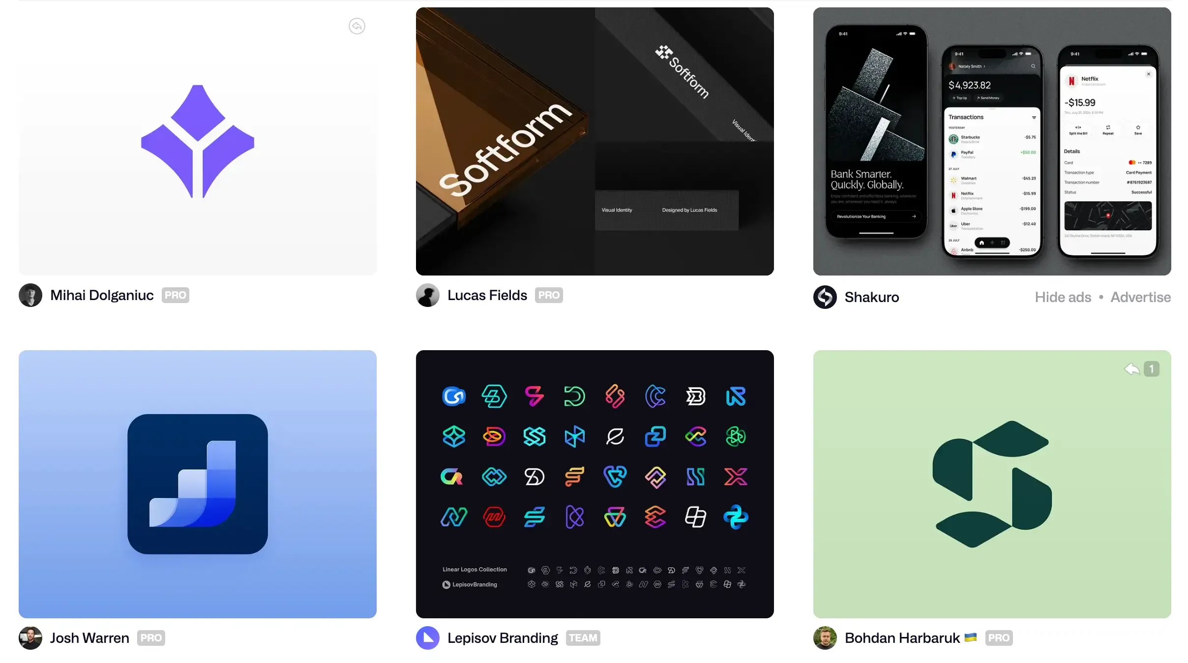
The logotype: first lasting impression
The Logotype is the most immediately recognizable element of a company's visual identity. It's often the first thing the audience notices, leaving a lasting impression.
A well-designed logo should be simple, memorable, and adaptable to a variety of mediums, from social media to printed materials. It captures the essence of the brand by reflecting its values and market positioning. It is an element wrench to establish instant recognition.

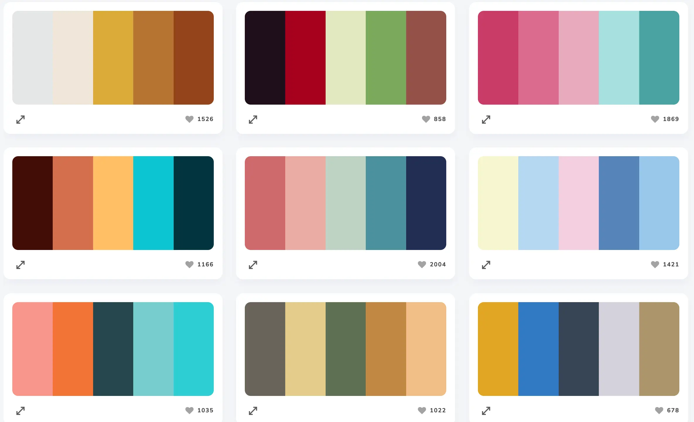
The color palette: evoking emotions
La color palette of a company plays an important role in evoking emotions and creating an atmosphere in harmony with its brand image. Colors send subtle messages that influence public perception.
For example, blue is often seen as a color that inspires confidence and stability, while red evokes energy and dynamism. A carefully developed color palette reinforces the visual identity and elicits positive emotional responses from the audience.
Typography: conveying the brand's tone
La typography is an essential pillar of visual identity, as it expresses the tone and personality of a brand. Typographic choices can convey emotions and convey specific values. For example, serif fonts often evoke tradition and elegance, while sans serif fonts are associated with modernity and dynamism.
Maintaining typographical consistency is essential to offer a brand image. uniform and easily recognizable on all communication media.
Images and icons: conveying messages without words
Les pictures And the icons are powerful visual tools that allow clear messages to be conveyed without using words. They can illustrate complex ideas or enhance the visual atmosphere that reflects the brand's identity.
The choice of images should be based on their ability to embody the values and tone of the brand. These elements help create a cohesive and engaging image, while also capturing the attention of the audience.
Communication media: diversifying the visual presence
Les communication media, whether in the form of printed documents, digital content or publications on social networks, play an essential role in the dissemination of a company's visual identity. Collaborate with a Webflow agency specialized for B2B companies can help you integrate these key elements into your website and other digital platforms. Each medium must integrate the key elements of the visual identity, such as the logo, the typography And the color palette. This makes it possible to create a coherent image and to strengthen brand recognition among the public.
By ensuring a visual communication homogeneous and powerful, businesses can establish a strong and lasting visual identity, a key factor in gaining credibility and notoriety.
Strategic use of visual identity
Brand consolidation and immediate recognition
THEvisual identity is a powerful tool to strengthen the brand and ensure instant recognition among the public. When graphic elements such as the logo, the colours And the typography are carefully harmonized, they form a unique visual imprint that remains deeply rooted in the minds of consumers.
This rapid recognition allows a company to assert its reputation while establishing a lasting relationship of trust with its customers, which contributes greatly to their loyalty.
Visual consistency across all touchpoints
Maintain a visual coherence on all of communication media is essential to maximize the impact ofvisual identity. Whether on the social networks, the website, printed materials or in marketing campaigns, respect the Graphic charter ensures a seamless and smooth experience for the public.
This visual uniformity reinforces the image of a professional, credible and easily identifiable brand, regardless of the point of contact with its consumers.
Differentiation on the market and with the competition
In an increasingly competitive market, thevisual identity plays a strategic role in standing out. One Graphic charter thoughtful and graphic elements distinctive characteristics make it possible to create a unique and memorable image, which is a key advantage over the competition. Using a branding agency in Paris can be a wise choice to define a coherent and impacting strategy, perfectly adapted to the expectations of the target audience.
This visual differentiation directly influences the perception of customers, orienting their choices and increasing the perceived value of the brand on the market.
Visual identity and conversion: a lever that is often underestimated
Visual identity directly influences conversion, especially in digital environments. A consistent and professional appearance reassures visitors, enhances their experience, and encourages them to take action, whether it's a purchase, registration, or contact.
Combined with good ergonomics and a clear message, it becomes a powerful lever for marketing performance. It is a strategic investment, both for the image and for the results.
Creation and development of a visual identity
Step 1: Define brand mission and values
The first step in the creation of a visual identity is to clarify the mission of your company as well as its fundamental values. This gives a clear direction to the design of the various graphic elements. By precisely defining these aspects, you ensure that each visual component, logo aux colours, reflects the essence and personality of your brand in an authentic way. This work facilitates communication that is aligned with your strategic goals and is sincere to your audience.
Step 2: Understand the target audience
A thorough understanding of your target audience is essential for effectively orienting the creation of the visual identity. By identifying the needs, expectations and preferences of your potential customers, you will be able to select visual elements relevant, whether it is the color palette, of fonts or the overall style of your Graphic charter.
This approach ensures that your visual communication will be relevant, attractive and engaging for your audience at the same time.
Step 3: Work with design professionals
Collaborating with graphic design specialists is essential to transform your ideas and values into a strong and coherent visual identity.
Experts in the field use adapted tools to create communication media harmonious and optimized for all formats, while respecting the specific constraints of each media. Their expertise makes it possible to design a logo powerful, to optimize the typography and to define a color palette strategic, thus guaranteeing a graphic identity both aesthetic and functional.
Tip: The moodboard: the starting point for artistic direction
Before even designing the logo or choosing a color palette, it's helpful to create a moodboard. This inspiration board brings together visuals, textures, fonts or graphic worlds in connection with the identity to be created.
The moodboard serves as a common base between the creative team and the client, setting a clear artistic direction. It helps to realize an abstract vision and to ensure that future choices will be consistent with the image to be transmitted.
Step 4: Design a comprehensive style guide
The final step is to develop a style guide Or a Graphic charter grouping together all the rules for using visual elements. This document is essential to maintain the consistency of your visual communication On all braces, whether printed or digital.
It details the proper use of colours, of logo, of the typography, images and spaces, thus allowing all stakeholders to respect a visual identity homogeneous and to strengthen the recognition of your brand.
Iconic examples of successful visual identities
Apple: Simplicity at the service of innovation
Apple is a model of success when it comes tovisual identity, thanks to its strategy of minimalism And ofelegance. The famous bitten apple logo has become a global symbol of innovation and tech high-end. La visual coherence is ensured by the constant use of neutral colors such as black, white and gray, thus reinforcing the premium image of the brand.
McDonald's: Recognition through color and logo
McDonald's is a remarkable example of the effectiveness ofvisual identity in instant recognition. Its iconic logo, with its golden arches on a red background, is recognized around the world and is often associated with its mascot, Ronald McDonald.
La color palette used, combining yellow and red, evokes a direct association with fast food and pleasant family moments. This simplicity, combined with a consistency in the use of logo, has greatly contributed to the universal recognition of the brand in the global food market.
Nike: The importance of the symbol for the transmission of values
Nike is a perfect example ofsignificance of a strong symbol in a visual identity. The famous “swoosh” is now synonymous with performance, motivation and sporting excellence. This powerful symbol embodies values such asinnovation, the perseverance And the leadership, thus consolidating the dynamic image of the brand.
By integrating his logo In iconic emotional campaigns like “Just Do It,” Nike has established a deep connection with its customers, creating a lasting and inspiring emotional relationship.
Visual identity redesign: when should it be redesigned?
A visual identity is not fixed in time. It evolves at the pace of a company's transformations: repositioning, new offer, merger, or desire to modernize. When a gap appears between brand perception and its real positioning, a redesign becomes necessary.
This approach does not mean starting from scratch. It could be a simple color update, a new logo, or a typography adjustment. The key is to maintain recognition while strengthening relevance. A well-conducted redesign allows the brand to stay in sync with its audience and its market.
Conclusion on the definition and the value of visual identity
In summary, a strong visual identity is essential for a business, as it guarantees the reconnaissance, the credibility and customer loyalty. It includes things like the logo, the typography and the color palette, which must be consistent across all communication media.
To be successful, it is important to clearly define the mission and brand values, to understand the target audience, and to collaborate with professionals in order to create a distinctive visual identity.
Take action today to strengthen your visual identity can become a decisive lever for your commercial success.
FAQ - Visual identity definition
How do I define the central message that I want to communicate through my company's visual identity?
To define the core message of your visual identity, start by clarifying the mission, values, and personality of your company. Identify what you want to convey to your target audience. This message should be consistent, momentous and reflect your vision in an authentic way, in order to guarantee recognition and differentiation.
What are the main elements that make up a brand's visual identity?
The visual identity of a brand mainly includes the logo, the color palette, the typography, graphic elements (icons, illustrations) and communication media. These elements ensure visual coherence and reinforce the brand image.
Why is it important to create a coherent visual identity and what is its impact on brand memory?
A visual identity Coherent is essential to strengthen the reconnaissance of the brand, project a professional and credible image, and improve the memorizing. It facilitates brand identification, inspires trust and plays a key role in customer loyalty while helping to stand out in a competitive market.
What is the difference between visual identity and graphic design, and why are they essential for a company?
The visual identity includes all visual elements that identify a company (logo, colors, typography), while the Graphic charter formalize their use. Together, they ensure consistency and reconnaissance of the brand, essential aspects to stand out and inspire confidence.
Synqro's latest achievement