
{{text}}
Share
Optimizing images, or “SEO image”, is a essential step to improve the natural referencing of your website. By optimizing your images, you not only boost their visibility in search results, but alsouser experience and traffic to your site.
With billions of monthly searches on Google Images, knowing how to take advantage of this potential is critical. SEO image includes practices like naming files, the use of the ALT attribute, the compressing images, choosing the right format, adapting to responsive design and adding structured data. These optimizations, in line with SEO trends, speed up the loading of your pages while helping search engines index your images.
Discover in this article from our webflow agency 7 practical tips to use your images as a powerful lever for your SEO strategy. And if you want to know more about our Webflow agency, click here !
1. Choosing the right image format
Classic formats vs modern formats
When you optimize your images for the web, the choosing the image format is essential. Classic formats like JPEG, PNG and GIF have long dominated, but with technological progress, modern formats now offer superior performances and better compression.
Classic formats are still useful in some specific cases. For example, JPEG is perfect for photographs and images that are rich in color thanks to its lossy compression, which reduces file size while maintaining acceptable quality.
For its part, PNG is ideal for graphics that require transparency or clear outlines. However, it often generates files that are larger than JPEG.
Why did WebP and AVIF become essential in 2025?
Modern formats like WebP and AVIF have revolutionized image optimization. They allow a lossless compression or with loss, significantly reducing file size while maintaining or even improving image quality compared to traditional formats.
For example, WebP supports both types of compression (lossy and lossless), offering smaller files while maintaining comparable or better quality than JPEG and PNG. As for AVIF, he is recognized for his advanced compression and its remarkable quality, and it is now compatible with the majority of browsers.
When should you use which format?
The choice of format depends on the type of image and its use. Here are a few recommendations:
- JPEG : Great for photographs and images that are rich in color. This format is particularly suitable when reducing file size is a priority.
- PNG : Perfect for graphics that require transparency or clear outlines, such as logos, icons, and images with transparent backgrounds.
- WebP/Avif : Recommended for websites that require high quality images with reduced file sizes. These formats optimize performance while providing excellent visual quality.
- GIF : Suitable for simple animations, but not recommended for static images due to its limited color palette.
- SVG : Great for vector graphics like logos, icons, and illustrations. This format allows a resizing without losing quality.
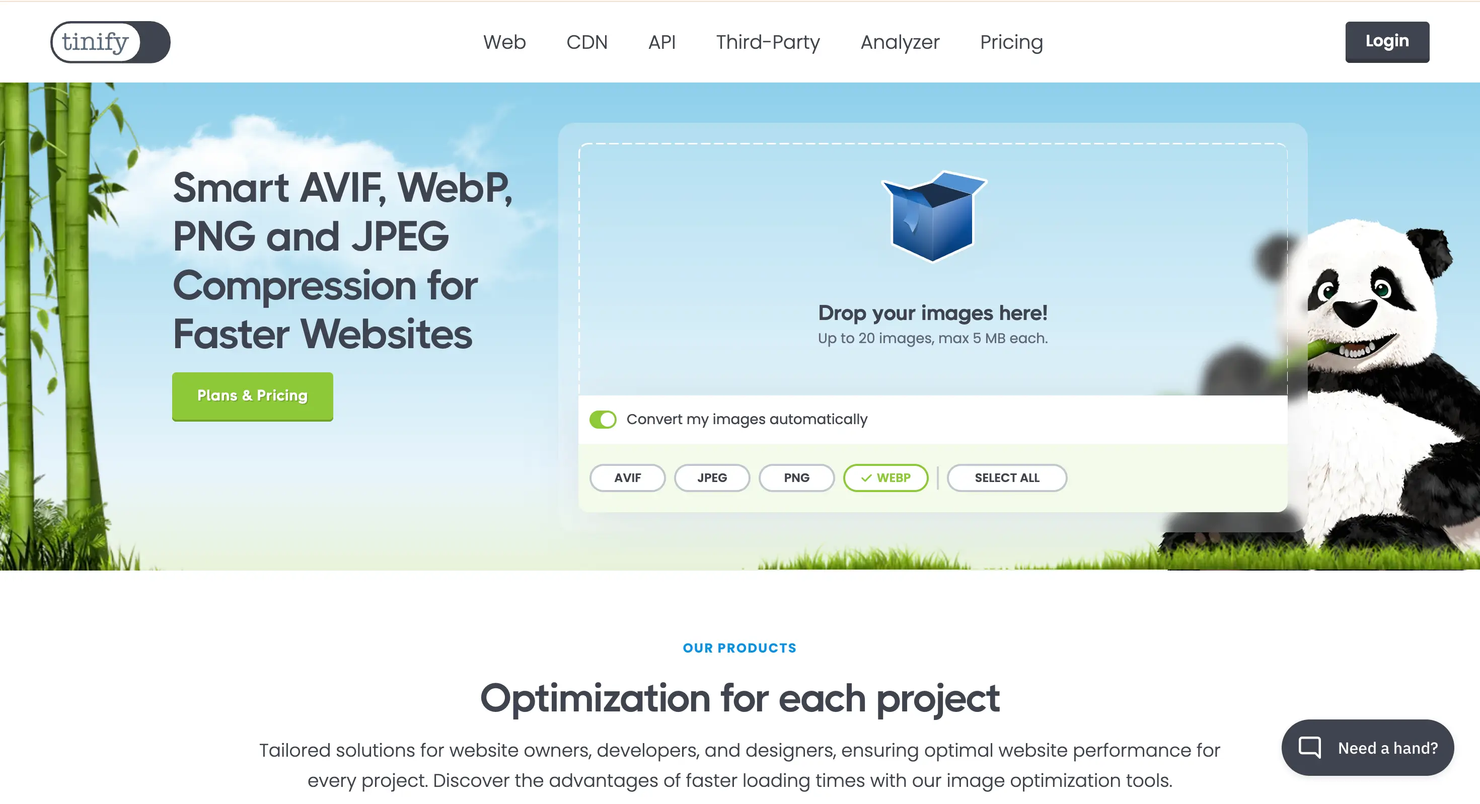
Tools to convert your images effectively
To convert your images into modern formats, several tools are at your disposal. Plugins like Smush for WordPress or TinyIMG for Shopify make it easy to optimize and convert to WebP or AVIF, while reducing file size and improving the performance of your website.
Online tools such as ImageOptim Or Specialized CDNs in optimizing images can also automate the detection of the best format for each browser and perform the necessary conversions. This approach simplifies the process while ensuring that your images are always served in the most appropriate format for each user.
2. Resize and compress images
The impact of image size on web performance
La size of the images plays a key role in the performance of your website. Images that are too big contain more data, which can slow down considerably loading times. This slowness can frustrate your visitors and cause them to leave your site before it is fully loaded.
In reality, images are often one of the biggest resources loaded by a browser. Their weight can directly influence critical metrics such as Largest Contentful Paint (LCP) And the Cumulative Layout Shift (CLS), which are performance indicators.
Additionally, improperly sized images can cause display problems on mobile devices. On these smaller screens, this can lead to distorted images or slow uploads, which affects the user experience, increases bounce rates, and negatively impacts your natural referencing.
Lossless or Lossless Compression: What to Choose?
Compressing images is an essential step in reducing their file size while maintaining their quality. Two types of compression exist: With loss and lossless.
Lossy compression, commonly used for formats like JPEG, reduces file size by removing some data from the image. It's ideal for photography, but it's essential to find a balance between size reduction and visual quality. Excessive compression can cause loss of detail and quality degradation.
In contrast, lossless compression, adapted to formats like PNG, preserves all image data while reducing file size. However, lossless compressed PNGs often remain larger than lossy compressed JPEGs, making them less practical for images that contain lots of colors.
Recommended tools for compression
To compress your images without compromising their quality, several powerful tools are at your disposal. TinyPNG and ImageMin are popular online solutions that use advanced compression techniques to reduce the size of JPEG and PNG files.
These tools eliminate unnecessary metadata and reduce the number of colors in the image, allowing for a significant reduction in file size while maintaining visual quality.
For WordPress sites, plugins like ShortPixel offer automatic optimization of background images. They can convert your files into modern formats like WebP or AVIF, while applying lazy loading to improve the loading times of your pages.
Integrate optimization into your workflow
For image optimization to become a smooth process, it is essential to automate it as much as possible. Use tools that can resize and compress your images as soon as they are uploaded to your site.
For example, set up plugins that automatically compress and resize your files as soon as they are added to your media library.
Additionally, incorporate regular image checks into your maintenance routine. Remove obsolete files and optimize those that exceed their size 500 KB. This approach ensures optimal web performance while offering high quality images adapted to your site.
3. Rename your files in a descriptive way
Why file names are important for SEO
The filename of an image plays a role in SEO optimization (Search Engine Optimization). Search engines, like Google, rely on these names to understand the content and relevance of the image to the context of the web page. A file name descriptive and rich in keywords allows search engines to index your content more accurately, improving your visibility in the search results.
In addition, a well-chosen file name improves theuser experience. It provides clear information about the content of the image, even if the image cannot be displayed. This is especially useful for users who navigate with screen readers or on slow connections.
Real examples of good and bad file names
Here are some examples to distinguish good and bad file names:
- Bad example: `img_1234.jpg` or `photo.jpg`. These generic names do not provide any information about the content of the image and are useless for search engines.
- Good example: `red-sports-car.jpg` or `strawberry ice cream.jpg`. These file names are descriptors and include relevant keywords, helping search engines understand image content and associate it with appropriate queries.
Automate image renaming
To save time, it is possible to automate the image renaming process using tools and plugins. For example, if you use WordPress, plugins like Yoast SEO or Rank Math allow images to be renamed in a descriptive manner when they are uploaded. These tools can also optimize other aspects of images, such as compressing or adding alternative text.
In addition, some content management platforms and CDN (Content Delivery Network) offer features to automate image renaming and optimization. This saves time while ensuring consistency in your naming practices.
SEO best practices for naming
To optimize your file names, follow these best practices:
- Use relevant keywords: Choose keywords that accurately describe the content of the image. However, avoid Keyword stuffing by varying terms and using synonyms.
- Separate words with hyphens: Use hyphens to separate words in the file name. For example, `bernese-mountain-dog.jpg` is better than `Bernese Mountain Dog.jpg` or `bernese_mountain_dog.jpg`.
- Use lowercase letters: Lower case letters are recommended to avoid case issues in URLs and to maintain consistency.
- Keep the names short: Limit file names to a maximum of five or six words. That makes them both short and descriptive.
4. Use the ALT attribute intelligently
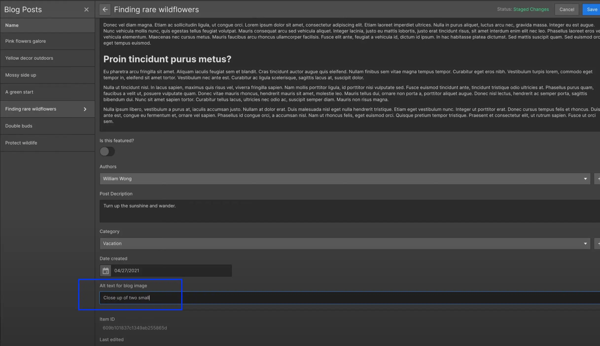
The role of ALT in SEO and accessibility
The attribute ALT plays an important role in both natural referencing (SEO) and in the accessibility of websites. In SEO, it allows search engines like Google to understand the content of images, which helps Index and to classify web pages according to their relevance. Google robots analyze ALT attributes to obtain information about the visual content of the page, strengthening the image's position in search results.
From an accessibility perspective, the ALT attribute is essential for visually impaired users or those using screen readers. It provides a text description of the image, allowing these users to understand the visual content of the page, even if the image cannot be displayed.
This practice significantly improves the user experience and meets web accessibility standards.
How to write an effective ALT
To write an effective ALT attribute, it is important to follow a few key principles:
- Use relevant keywords : Include keywords that accurately describe the content of the image and that are relevant to the subject of the page. This helps search engines understand the context of the image and improve its positioning in search results.
- Keep it concise and clear : ALT attributes should be short and to the point. Use short sentences, ideally between 5 and 15 words, to provide a clear and quick description of the image.
- Avoid keyword stuffing : Don't overload the ALT attribute with too many keywords. This can be considered an abusive technique and damage the user experience as well as the SEO of your site.
Common mistakes to avoid
There are several common mistakes to avoid when writing ALT attributes:
- Omit the ALT attribute : All images should have an ALT attribute, even the ones that seem less important. The absence of an ALT attribute can negatively impact the SEO and accessibility of your site.
- Use the same alternative text for multiple images : Each image should have a unique and personalized ALT attribute. Reusing the same text for multiple images can give the impression of duplicity and affect your positioning in search results.
- Neglecting spelling and syntax : Ensure that ALT attributes are spelled correctly and free of grammatical errors. This maintains a professional image and optimizes the user experience.
ALT vs Image title: do not confuse
It is important not to confuse the ALT attribute with the image title. The ALT attribute is a text description of the image, used by search engines and screen readers, while the image title is a caption that appears when the user hovers over the image. The image title is not read by search engines and does not replace the ALT attribute.
Use the ALT attribute to provide a functional and descriptive description of the image, and the image title to add additional information or contexts that may be useful for users but are not essential for SEO or accessibility.
5. Adapting images to responsive design
The importance of responsive in 2025
In 2025, the responsive design is more important than ever to provide a smooth and consistent user experience across devices. With the increasing diversity of connected devices — smartphones, tablets, tablets, desktops, and even connected objects (IoT) — it is essential that your images adapt dynamically to different screen sizes and resolutions.
A responsive design ensures that your website stays reachable and workable for everyone, thus improving user engagement and SEO performance. Internet users expect experiences that are fast, functional, and beautiful. A site that is poorly adapted to different devices may discourage them, leading to a higher abandonment rate. Therefore, complying with responsive design standards is now essential to maintain a competitive online presence.
Techniques for adapting images (srcset, sizes)
To make your images perfectly adapted to responsive design, several techniques can be implemented:
- Using the attribute
srcset: This attribute allows you to specify several versions of an image at different resolutions. The browser automatically chooses the most suitable version based on screen size and pixel density. For example:<img src="image.jpg" srcset="image-small.jpg 300w, image-medium.jpg 600w, image-large.jpg 1200w" /> - Using the attribute
Sizes: Associated withsrcset, this attribute defines the screen sizes for which each version of the image will be used. For example:<img sizes="(max-width: 600px) 100vw, 50vw" src="image.jpg" srcset="image-small.jpg 300w, image-medium.jpg 600w, image-large.jpg 1200w" /> - CSS Media Queries : CSS media queries allow you to adjust styles according to the size of the screen, which includes adapting images and layout. Example:
@media (max-width: 768px) {img {width: 100%;}}
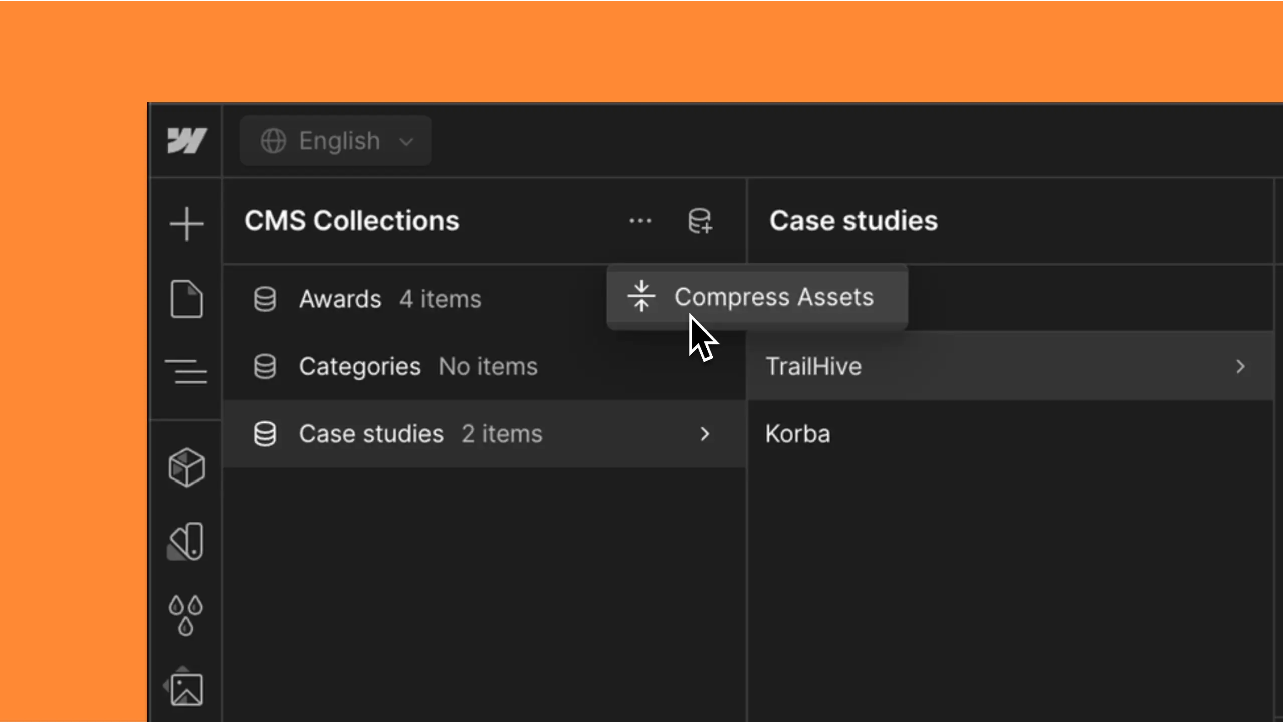
Examples of implementation (especially with Webflow)
The implementation of responsive images can be simplified thanks to modern tools and platforms like Webflow. If you work with a Webflow agency, you can leverage their skills to take advantage of advanced features that ensure your images are optimized for all screens. Here are a few examples:
- With Webflow : Webflow makes it easy to create responsive designs thanks to an intuitive interface. You can set breakpoints for different screen sizes and adjust image properties. For example, set up an image to occupy 100% the width of the screen on mobile and 50% on a desktop computer.
- Practical code example : Here is an example combining
srcset,Sizesand CSS:<img sizes="(max-width: 600px) 100vw, 50vw" src="image.jpg" srcset="image-small.jpg 300w, image-medium.jpg 600w, image-large.jpg 1200w" />@media (max-width: 768px) {img {width: 100%;}}This example ensures that the image fits the size of the screen while loading the most appropriate version. This minimizes load times and improves the user experience.
6. Set up lazy loading
Definition and operation of lazy loading
The Lazy loading, or “delayed loading”, is a technique for delaying the loading of non-critical resources on a web page until they are actually needed. In contrast to early loading (Eager Loading), which loads all resources simultaneously, lazy loading waits for the user to scroll the page or interact in a specific way to load multimedia content, such as images and videos.
This method identifies non-blocking (non-critical) resources and only loads them when they are needed. This shortens the critical rendering path and reduces charging time of the page.
SEO and UX benefits of lazy loading
Lazy loading offers numerous advantages, both for the user experience (UX) and for natural referencing (SEO):
- Improving the user experience: By loading visible resources first, lazy loading speeds up the page's display, which improves navigation and reduces the bounce rate. This allows users to engage with content more quickly, increasing satisfaction and engagement.
- Bandwidth savings: By loading only the resources that are visible initially, this technique reduces bandwidth consumption. This is especially useful for users with slow connections or limited data plans.
- Positive impact on SEO: Increased loading speed through lazy loading can improve SEO performance, as search engines like Google take this criterion into account in their ranking algorithms.
How to easily integrate it on a modern site
There are several methods to integrate lazy loading on a modern site:
- Native lazy loading: Modern browsers like Google Chrome, Firefox, Firefox, Edge, and Opera support this feature natively. Just add the attribute loading="lazy” To the beacons <img> and <iframe>. For example:
<img src="exemple.png" loading="lazy" alt="..."><iframe src="https://exemple-domaine.fr" loading="lazy"></iframe>
This method allows the browser to handle delayed loading without requiring an additional JavaScript library.
- Use of JavaScript plugins and libraries: For sites that require greater flexibility or for older browsers, plugins like LazyLoad or Lazy Load Remastered can be used. These scripts allow images and videos to be loaded at a later time while offering attractive visual effects.
Tips for optimal lazy loading
Here are some tips for optimizing the use of lazy loading:
- Identify non-critical resources: Analyze which images and videos are not immediately visible when the page is opened and apply lazy loading to only those elements. This ensures that the main content is loaded first.
- Use the Intersection Observer API: This API detects when an element enters or leaves the viewing area (Viewport) of the browser. This allows resources to be loaded more accurately and efficiently.
- Avoid backtracking problems: Ensure that the structure of your page is well optimized to avoid problems navigating or loading resources. Good content organization improves the user experience.
- Test and adjust: Test lazy loading on different devices and browsers to make sure it works. Adjust settings as needed to maximize performance and provide the best user experience.
7. Add structured data (Schema.org)
Why enrich your images with semantic markup
Enrich your images with semantic markup using Schema.org can significantly improve the visibility and the understanding of your content by search engines. This markup provides structured metadata that help search algorithms better understand the context and content of your images. This can increase the chances of your images appearing in search results, especially in Google Images.
This semantic markup is also beneficial foraccessibility And theuser experience. It provides additional information that can be used by screen readers and other assistive technologies, contributing to a more inclusive and rewarding experience for all users.
The role of schema.org/ImageObject
The guy ImageObject by Schema.org is specifically designed to describe images in detail. It makes it possible to provide information such as:
- TheURL of the image,
- her width And her height,
- one legend or a description,
- and even metadata such as the language of the text associated with the image.
The properties required for a ImageObject include:
@type,@id,url,- and
ContentUrl, all of which should point to the image's absolute URL.
Optional properties like Caption, Height, Width, and InLanguage can also be added to provide more context.
JSON-LD implementation tutorial
Implement semantic markup with JSON-LD is relatively simple. Just add a script in the section <head> or <body> of your web page. Here is an example of markup for a ImageObject :
<script type="application/ld+json">{"@context “:" https://schema.org “," @graph “: [{" @type “: “ImageObject”, "@id “:" https://www.example.com/uploads/example-image.jpg “, “url”: "https://www.example.com/uploads/example-image.jpg “, “contentUrl”: "https://www.example.com/uploads/example-image.jpg “, “caption”: “caption”: “Example caption”, “example caption”, “example caption”, “example caption”, “example caption”, “example caption”, “example caption”, “example caption”, “example caption”, “example caption”, “example caption”, “example caption”, “inLanguage”: “inLanguage”: “en-US”, “height”: 120, “width”: 120}]}</script>
This example shows how to describe an image with required and optional properties. This helps search engines understand and to Index the image more accurately.
Positive effects on visibility in Google Images
Adding structured data to your images can have significant positive effects on their visibility in Google Images. Images that are well described with semantic markup are more likely to appear in visual search results, which can increase the trafficking to your website and improve your SEO positioning.
Additionally, Google may show additional information in search results, such as captions or descriptions. It makes your images look more attractants and engaging for users, thus improving Click-through rate and conversion. Users will have a better idea of what they are going to find when they click on the image, which reinforces their interest.
Conclusion
In summary, Optimize images for SEO is an essential and multifaceted strategy that can significantly improve the visibility and performance of your website. Working with a Webflow expert can also maximize your results by combining expert management of Webflow tools with best practices in image optimization for SEO.
In addition, it is important to adapt your images to responsive design, to implement the Lazy loading, and to add structured data via Schema.org. These actions play a key role in the overall improvement of your site.
By applying these best practices, you can not only improve the loading speed of your site, but also improve the user experience and increase your organic traffic. Remember to test and adjust your strategies regularly to ensure continuous optimization.
Don't waste any more time: start implementing these practices today to see a significant improvement in your SEO results.
Remember, optimizing images is not a one-time task, but an ongoing process that requires regular attention. By integrating these best practices into your workflow, you can transform your images into a real strategic asset for your SEO and attract more qualified traffic to your site.
FAQ — Optimizing SEO images
What is image SEO?
Image SEO, or “image SEO”, refers to all the techniques used to optimize images to improve their visibility in search results (in particular Google Images) and contribute to the good positioning of web pages. This includes file structure, metadata, image size, and accessibility.
Do images influence SEO?
Yes. A well-optimized image can appear in Google Images, generate qualified traffic, and improve the user experience. Conversely, images that are too heavy or poorly configured can slow down the site, affect its Core Web Vitals performance, and negatively impact SEO rankings.
How do I add SEO to an image?
To optimize an image in SEO, you must:
- Give it a clear and descriptive file name, containing keywords;
- enter a relevant and unique ALT attribute;
- use a suitable format (WebP or AVIF preferably);
- enable lazy loading for offscreen images;
- adapt the image to different screen sizes (responsive);
- integrate structured data (Schema.org) if relevant.
What image format is recommended for good SEO?
The modern WebP and AVIF formats are preferred, as they offer excellent quality with reduced weight. JPEG remains relevant for photographs, while PNG is useful for visuals that require transparency. SVG is ideal for vector icons and logos.
Synqro's latest achievement