{{text}}
Share
When you create a website on Webflow, the layout and positioning of the elements play a role gist to guarantee a user experience that is both fluid and aesthetic. Managing the position of Webflow elements correctly will allow you to have precise control over their display and placement thanks to the properties CSS specific.
Understanding these different positions is indispensable to create designs that are both attractive and functional. Whether you work with text, images, buttons, or any other type of element, mastering these concepts will help you optimize your creations.
In this article, we'll take a detailed look at the various positioning options available in Webflow. Among them, we will find the positions Static, Relative, Absolute, Fixed, Sticky, as well as the positions Floating (Float & Clear). You will discover why positioning is a key element of Web design and how each CSS property can be used to perfect your Webflow project. If you are based in France, Contact Synqro to offer you appropriate professional support.
Introduction to CSS positions in Webflow
In Webflow, the CSS positions are powerful tools to control the layout of your items on a web page. These properties, applied to Webflow elements, allow you to define How the elements interact with each other and with their parent container. Understanding these concepts is essential for creating modern web layouts and flexible.
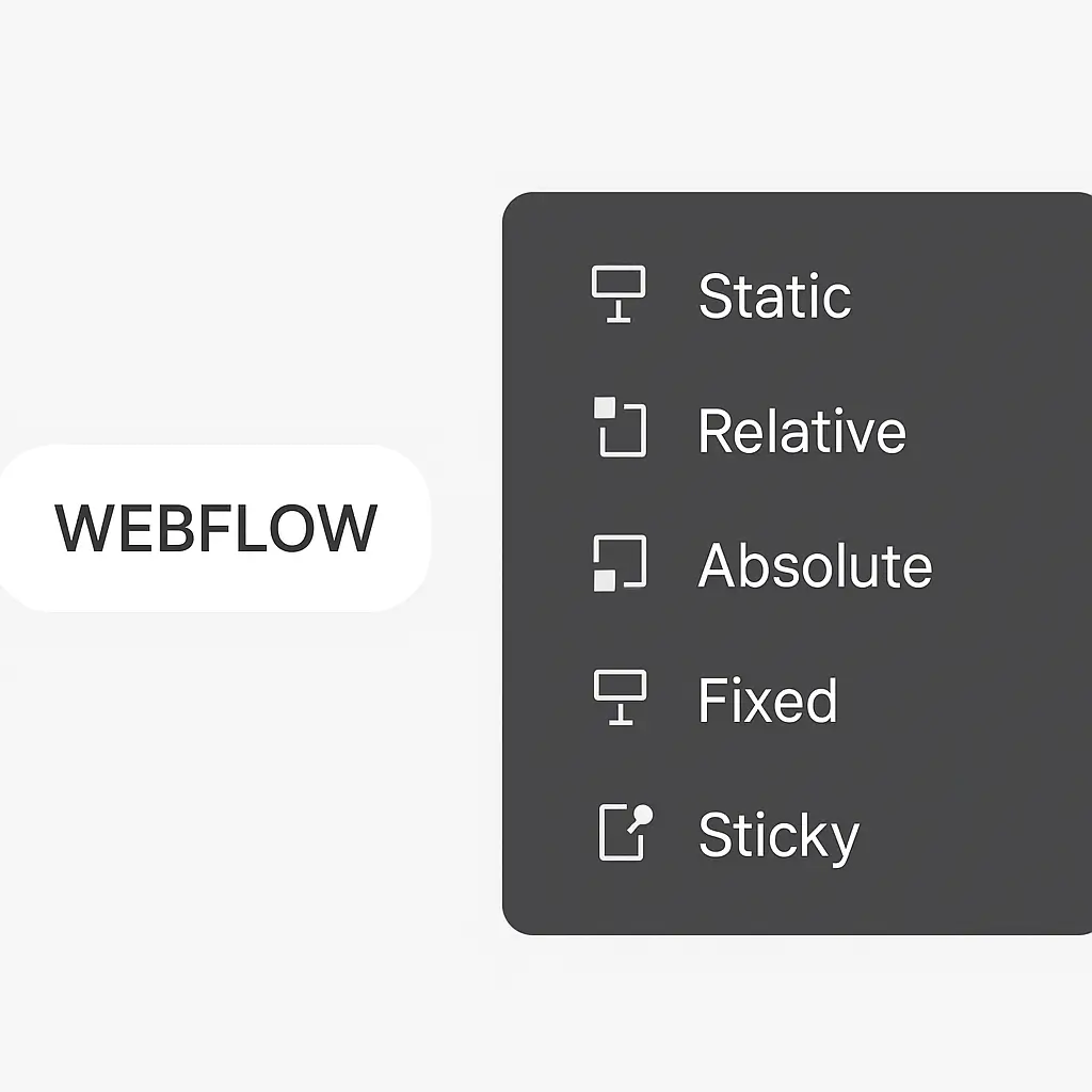
CSS positions in Webflow include several key values for the property. stance : Static, relative, Absolute, Fixed, and Sticky. Each of these values influences how an element is positioned in the document and interacts with other surrounding elements.
The Webflow style panel simplifies the configuration of these properties. It allows you to specify positions and other CSS attributes directly via a intuitive user interface. For example, you can use properties Top, Left, Right, and Bottom to precisely adjust the position of an element once its property stance is defined.
In addition to these positions, Webflow also offers the possibility of using Float and Clear to design layouts where text or other Webflow elements can be adapted around images or other content. These combined tools offer a great flexibility in the creation of modern and responsive web designs.
Why positioning is important in web design
The positioning of the elements in web design is important for several reasons. First of all, it directly influences how visitors interact with your website. A good layout allows Guiding attention from the visitor to the most important information, often summarized in the visible space without scrolling, known as “Above the Fold”.
La visual hierarchy plays a major role in this context. By properly positioning key elements such as the logo, key messages, and calls to action, you can create a logical visual flow that leads the visitor to follow the path you have defined. This means that priority information, such as company name and contact details, is placed in such a way that it is immediately visible and accessible.
THEalignment and the use ofwhite space (or “white space”) are also essential aspects of positioning. A well-thought-out alignment makes your site look cleaner and organized, reducing visual chaos and making it easier for users to navigate. In addition, careful use of white space makes it possible to render the page Clearer and less overloaded, while highlighting essential information.
Finally, positioning has a direct impact onuser experience global. Good positioning of elements improves the readability and navigability of the site, encouraging visitors to explore more and to interact with your content. This contributes to better conversion and increased user satisfaction, both of which are essential to the success of your website.
If you want to concretely visualize how the different CSS positions work in Webflow, I highly recommend this official video:
In this clear and dynamic tutorial, the Webflow team visually illustrates the effects of each type of CSS position (Static, relative, Absolute, Fixed, Sticky) directly in the Webflow interface. This allows you to better understand how each property affects the layout of items on a web page.
This video is ideal for:
- Beginners who want to understand the behavior of elements in Webflow.
- Designers who want to use CSS positions to create dynamic interfaces.
- Developers looking to master the positioning context in complex layouts.
The Static position
How it works
The position Static Is the default value Of the property stance in CSS. When an element is positioned statically, it follows the normal flow of the document and cannot be moved using the properties Top, Left, Right, or Bottom.
Static elements are displayed in the order they appear in the HTML code and take up the space needed according to their waistline And of their contents.
When to use
The position Static is ideal when you want your items to be displayed in a linear and natural, without changing their position relative to the flow of the document. This is particularly suitable for text content, images, and other items that need to be arranged in an order. sequential.
Because static elements remain in the document flow, they influence the layout of surrounding elements in a predictable manner. This makes it possible to create simple layouts and consistent.
Relative position
How it works
The position Relative allows you to position an element in relation to its original position in the document flow. When an element is defined with position: relative, it keeps its place in the document flow, but you can move it using the properties Top, Left, Right, and Bottom.
This means that the element is staggered compared to its static position, but its original space in the document is still reserved, as if there was a “heated seat” in its place.
This behavior is especially useful when you want to move an item without affecting the layout of the other items around it. For example, if you define left: 20px for an element with position: relative, it will be offset 20 pixels to the right from its original position, without modifying the position of the other elements on the page.
Benefits
One of the main advantages of the position Relative Does it allow you to create layouts flexible without disrupting the normal flow of the document. This is especially useful when you need to position items relatively to each other, especially when using items with Position: absolute that should be positioned in relation to a relative parent.
In addition, the position Relative is often used to define a positioning context for child elements. For example, if you have an item with position: relative and you want to position one of his children with Position: absolute, the absolute element will be positioned in relation to the relative element. This method offers great flexibility in creating complex layouts.
The Absolute position
Positioning in relation to a parent
When an element is defined with Position: absolute, it is removed from the normal flow of the document and no longer takes up space in the layout. This element is then positioned in relation to its Ancestor positioned the nearest. If no ancestor is found, it will be positioned in relation to initial container block of the document. This means that the absolute element is positioned according to the values of the properties Top, Right, Bottom, and Left with respect to this ancestor or container block.
It is essential to understand that for the absolute element to be positioned correctly, its parent must have a property stance defined, generally relative. This creates a positioning context for the absolute element, allowing it to position itself relative to this parent rather than to the document's initial container block.
Common use cases
The Absolute position is particularly useful in several common scenarios. One of the most common use cases is the creation of pull-down menus or panels that should appear above the main content.
For example, a lateral pull-down menu can be positioned in absolute terms with respect to a relative parent, allowing it to appear or disappear without affecting the layout of the other items on the page.
In addition, the Absolute position is often used for Overlays, modals, and tooltips, where elements must be positioned precisely and independent of the normal flow of the document. These elements can be placed anywhere on the page without disturbing the structure of the main content, which is especially useful for complex user interfaces.
The Fixed position
Scrolling and docking
La Fixed position allows you to position an element so that it stays in the same position with respect to the navigation window (viewport), regardless of how the page is scrolled. Contrary to the Absolute position, which refers to a positioned ancestor, the Fixed position always refers to the original container block of the document. However, if an ancestor has properties like Transform, prospect or Filter set to a value other than None, it changes the container block.
This property is especially useful for creating items that need to remain visible and accessible even when the user is scrolling through the page. Common examples include navigation bars, the headings, footers, as well as chat widgets or social media sharing bars, which should remain anchored to a specific corner of the screen.
Examples in Webflow
In Webflow, using the Fixed position is simple and offers great flexibility to design interactive designs. For example, you can create a fixed navigation bar that stays at the top of the page even when the user is scrolling. To do this, simply define position: fixed on the navigation bar element, then adjust its precise position in relation to the navigation window using the properties Top, Left, Right and Bottom. Using a Webflow Paris agency can also help you master this feature and integrate it perfectly into your design.
In addition, the Fixed position is ideal for items such as call to action (CTA) buttons that should remain visible while scrolling, or for notifications that appear at the top or bottom of the page without moving. In the Webflow style panel, you can easily configure these properties and see the results in real time, which greatly simplifies the design and layout process.
The Sticky position
How does the sticky work
La Sticky position is a CSS property that allows an element to behave like an element relative until it reaches a certain scrolling threshold. Once this threshold is reached, it behaves like an element fixed. In other words, the element stays in the document flow and moves with the content until it reaches the position specified by the properties Top, Right, Bottom, or Left.
Once this threshold is reached, the element “sticks” to the defined position and remains fixed in relation to the scrolling area, usually the navigation window (Viewport).
For sticky positioning to work properly, it is necessary to specify at least one of the properties. Top, Right, Bottom, or Left. For example, if you define Position: sticky and Top: 10px on an element, it will remain relative until it is at 10 pixels from the top of the scroll area. From that point on, it will become fixed in this position.
Webflow limitations
Although the Sticky position is very useful, it may present some limitations in Webflow and in browsers in general. One of the main limitations is related to the sticky element's parent container.
For sticky positioning to work, the sticky element must be contained within an element with scrolling behavior. This means that the parent container must have a property Overflow set to Scroll, auto, or sometimes Hidden. If the parent container does not have this property, sticky positioning will not work as expected.
In addition, it is essential to take into account the hierarchy of elements and the styles applied to parents. For example, if a parent owns a property Transform, prospect, or Filter, this can influence the behavior of the sticky element by changing the container block. In Webflow, it is primordial to test these configurations carefully to ensure that the sticky positioning works as expected.
Floating positions (Float & Clear)
Legacy of traditional CSS
The properties Float and Clear Are fundamental elements traditional CSS. They allow you to create layouts where text and inline elements can be adapted around floating elements. The property Float Used to position an element to left or at righthand of its container, thus allowing text and inline elements to wrap around it.
Possible values for Float include Left, Right, None, and Inherit.
The property Clear is used to define how an element should behave in relation to the floating elements that precede it. The values of Clear Can be None, Left, Right, or Both, indicating which side floating elements should not float on.
For example, if an item is floated to the left, you can use clear: left for the next element to be offset below the floating element.
The use of properties Float and Clear is especially useful for scenarios where text needs to wrap around images or other elements. However, they can also introduce complexities in the management of layouts, especially when containers do not properly wrap floating elements. This can cause container height and width issues.
Modern alternatives in Webflow
In Webflow, although the properties Float and Clear are still available, there are modern alternatives and more flexible to manage layouts. One of the most common methods is the use of Flexbox And Grid, which offer better management of spaces and positions of elements without the complications of floating elements.
Flexbox and grid layouts allow you to create page structures. more robust and easier to maintain. For example, you can use properties Display: flex or Display: grid to organize your elements in a more precise and adaptable way, without having to resort to properties Float and Clear. These modern methods are often preferred because they offer a great flexibility and better compatibility with responsive designs.
Best practices for positioning in Webflow
When working with item positions in Webflow, follow some best practices can significantly improve the quality and maintainability of your design. First of all, it is important to plan carefully your page structure before you start positioning the elements.
Use Sections, of Containers And Grids as the basic elements of your layout can help maintain a clear and structured organization of your content.
Webflow's advanced layout tools, such as Grids And the Columns, can also simplify the positioning process. These tools allow you to create layouts flexible and adaptive, which is especially useful for responsive designs that need to be displayed correctly on a variety of devices and screen sizes.
It's also important to test your design regularly across devices and browsers to make sure the positions of the elements behave as expected. Webflow offers tools for previewing that allow you to see how your page will behave on different devices. These tools can help you pinpoint and to correct positioning problems before publishing your site.
Finally, use wisely the z-index can be important for managing the layering of elements, especially when working with absolute or fixed positions. Be sure to set the z-index so that the most important elements be displayed above the others, which improves user experience and the readability of your page.
Conclusion and recommendations
With a thorough understanding of the different CSS positions available in Webflow, you are now better prepared to design sophisticated web designs and functional. Each position type — Static, Relative, Absolute, Absolute, Fixed, Sticky, and Floating positions — offers unique possibilities to structure your page elements effectively and aesthetically.
It is essential to choose the positioning method that suits your design goals and the specific needs of your project. For example, Webflow's flexible layouts and grids can be harmoniously combined with Relative and Absolute positions to design complex and adaptive layouts.
Likewise, the Fixed and Sticky positions are particularly suitable for items that need to remain visible while the page is scrolling, thus offering an optimized user experience.
In practice, it is advisable to start with a solid base structure using Sections, Containers, and Grids to organize your content. This approach simplifies the management of elements while ensuring a harmonious and well-structured layout.
Remember to test your design regularly on different devices and browsers to ensure optimal compatibility and a smooth user experience.
Finally, master advanced CSS properties, such as z-index, and understanding how they interact with the different positions can significantly improve the final quality of your design. Take the time to practice and experiment with these tools to develop your web design skills and create sites that meet the expectations of your users.
Conclusion
In summary, the Control of CSS positions in Webflow is indispensable to design web designs at the same time aesthetics and functional. Each type of position — Static, Relative, Absolute, Absolute, Fixed, Sticky, and Floating positions — offers unique possibilities to organize your page elements accurately.
By taking advantage of these tools thoughtfully, you can offer a smooth user experience and ensure a consistent layout across all device types.
Remember that the careful planning of your page structure, the use of advanced layout tools of Webflow, as well as regular tests on various devices are essential for a successful design. Take the time to experiment and apply these concepts in order to improve your web design skills and create sites that meet the expectations of your users.
FAQS
What is the difference between an absolute position and a fixed position in Webflow?
The main difference between a position Absolute And a position Fixed in Webflow lies in their reference and their behavior:
- Absolute: An element with
Position: absoluteis removed from the normal flow of the document and positioned in relation to its nearest positioned ancestor. If no positioned ancestor exists, it is positioned in relation to the initial containing block (usually the elementhtml). - Fixed: An element with
position: fixedis also removed from the normal flow of the document, but it is positioned in relation to the Viewport (the visible part of the browser).
This means that the element with a fixed position stay in the same position even when you're scrolling.
How does the sticky position work in Webflow, and when do you use it?
The position Sticky in Webflow allows you to fix an element at a specific position when scrolling. To use it, you need to set the property Position: sticky in the style panel, then specify the position (for example, Top: 100px) where the element should be attached.
This is especially useful for maintaining items Important, such as navigation menus or forms, visible while scrolling the page.
What are the benefits of using the fixed position for items like navigation bars?
The benefits of using the position Fixed for things like navigation bars include:
- Constance: The navigation bar is always accessible regardless of the user's position on the page.
- Permanent visibility: This improves the user experience by making it easier to navigate and making options always available.
How do I specify the trigger point for a sticky position in Webflow?
To specify the trigger point for a position Sticky in Webflow, follow these steps:
- Select the element you want to make sticky and in the style panel, set its property
stanceuponSticky. - Make sure that the parent of this element has a position relative for the sticky to work properly.
- Add properties like
Top,Bottom,Left, orRightto define the exact point where the element becomes sticky when scrolled.
These adjustments ensure that the element fits in the right place while maintaining the structure of the page.
Synqro's latest achievement